Card Style Guide
Card Style Guide
This "theme" introduced
This "theme" provides you with four different elements, that combined give you a nice and functional layout. The basis for all these elements is button-card that allows for a great and individual styling. These elements, "cards", "chips", "title" and "vertical buttons", are fully customizable and can be enhanced to fit your needs.
All this is only possible, because we are able to use the templating function from button-card.
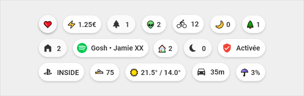
Chips
At the top of each page you can find the chips, which allow to quickly visualize important information.
Title
Titles are used to separate the different sections. Kind of a divider.

Vertical buttons
Vertical buttons show the information vertically aligned. These find their use eg. as navigation or scene buttons.

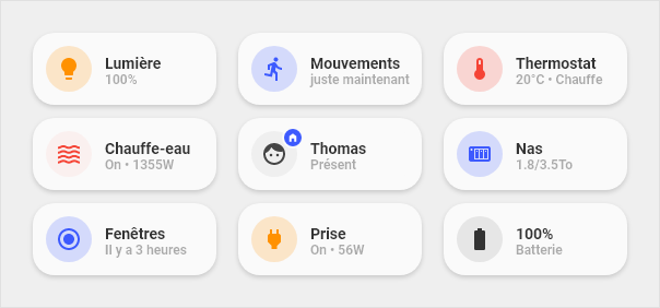
Cards
Cards are the main part of this design and are widely used in very different designs and functions. With these cards you can set up nearly every entity in HA, showing from "state-only" over a "full blown" information graphic with various values to "controlling" your covers and climate entities.
Anatomy of cards
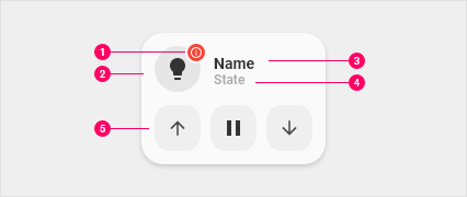
- Dot: Visible when the device is unavailable. Also used on the entity person
- Icon: Icon that represents the device
- Primary line: Main information
- Secondary line: Secondary information
- Optional part: Possibility to display buttons to launch actions related to the device. Or display a graph to view the history of a sensor or you let your fantasy take the ride...
In the list above #5 enhances the normal cards with a "second line", that is used to display other information like a graph or the controls for your covers. For this readme the cards are divided into three groups:
- 1-line cards: These are cards for
sensororbinary_sensorslike light or power outlets. - 2-line cards: These are cards with a second line for information or controls, eg. your
cover controls. - Custom cards: These are special cards, that you can install, only if needed. These cards are mostly developed and contributed to the repository. Eg. an
aircondition-cardthat shows the state of your aircondition and buttons to control it.
Color Scheme
| Type | Color | Hex | RGB |
|---|---|---|---|
| 💡 Light ⚡ Electricity |
#FF9101 | rgb(255,145,1) | |
| 🔥 Heating | #F54436 | rgb(245,6,54) | |
| ☑️ on/off 🏠 Home |
#3D5AFE | rgb(61,90,254) | |
| 🌳 Exterior | #01C852 | rgb(1,200,82) |
Icons
For the chips, this “theme” uses the standard unicode emojis. The main reason is, they are multi-color whereas the mdi-icons that HomeAssistant uses are one color only.
These emojis are only used on the chips, all other cards or buttons use the standard mdi-icons!
Overview over standard unicode emojis:
Overview Home Assistant mdi-icons:
Using emojis is easy:
- Go to one of the Github pages above
- Select the emoji you want and copy it (“CTRL + C” or right-click “copy” / at emojipedia.org you already find a “copy” button)
- Go to your view and paste the icon
Note: There are a lot of emojis on these pages, so we suggest you use the built-in search at emojipedia or the browser integrated search by pressing “CTRL + F” and type in your query like “heart”.
Language specific buttons
Sometimes the language specific strings from Home Assistant aren't available for your button, so we added the possibility to use language specific strings over the template system.
Custom cards
This "theme" is designed with an open structure in mind, that's why it is possible to add custom-cards without much hassle. A few custom-cards are readily available through the folder custom-cards in the repository.
Custom-cards are cards, that don't fit everywhere and therefore are not part of the standard installation, but can be easily added, if needed. Take an air-condition card. Not everybody has an air-condition. So why include this card as a default? And that's why we did a structure and system for custom-cards. Easily added, but only when needed!
And the best thing is: everybody can develop a cool card and can (not have to) share it afterwards with the community (hint, hint, the support thread is here).
See a complete list of already included custom-cards in our wiki.
Find information on how to develop a custom-card here.
Extend with your own code
As we tried to be as modular as possible (and useful), it is easy to enhance or extend the code, we provide with your own definitions. That means for you, you can inherit every template to enhance it only with functions, you really want. No need to copy full blocks of code - just inherit and enhance only where changes are needed.
We provided some instructions in our wiki, see this page.