Custom Card "Room"
Credits
- Authors:
- Everything Smart Home - 2022
- mpeterson
- rensknoors
- staegerino
- Full credit to user bms on the forum, they created the design and base of it in full, EverythingSmartHome put it into a PR as the basis
- beasthouse and basbruss on the EverythingSmartHome discord channel for emoji/humidity customization
- mpeterson added support for a switch to control climate and also to remove the need to have an entity associated
- staegerino added support for a switch to control covers
- Version: 2.2.1
Changelog
1.0.0
Initial release2.0.0
Breaking changes! This change introduces two variables to allow the display of the card with no buttons, one for light, one for climate or both for light and climate. It also now allows the use of no entity at all.2.0.1
Fixes text overflow issue over the climate button.2.1.0
- It now uses the `ulm_actions_card` template, which allows the usage of the popups wherever custom actions are set as `popup`. - Allow overflowing label and text to the climate button area whenever there is no climate button.2.1.1
Add support for the new popup framework while maintaining backwards compatibility with the old one.2.2.0
Introduces a new variable that lets you set the card background to the color of a light entity.Add support for cover
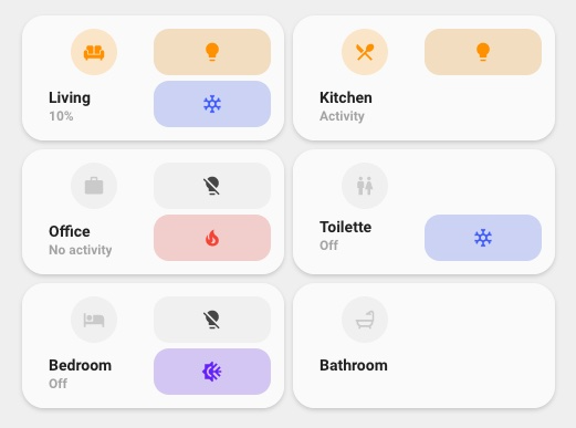
Description
This is an alternative room card to the standard one that is more rectangular than square.
Variables
| Variable | Default | Required | Notes |
|---|---|---|---|
| entity | The entity to represent on the room icon | ||
| Name | Name of the room to display | ||
| icon | The icon to show | ||
| tap_action | The action to perform when tapping | ||
| label | The label to display information, this can be a template or static text | ||
| ulm_custom_card_esh_room_light_entity | The entity to use for the light button | ||
| ulm_custom_card_esh_room_climate_entity | The entity to use for the climate button | ||
| ulm_custom_card_esh_room_cover_entity | The entity to use for the cover button | ||
| ulm_card_esh_room_light_icon_on | Customize the light ON icon | ||
| ulm_card_esh_room_light_icon_off | Customize the light OFF icon | ||
| ulm_card_light_enable_popup | false |
Enable popup_light |
|
| ulm_card_thermostat_enable_popup | false |
Enable popup_thermostat |
|
| ulm_card_dynamic_color | false |
Enables dynamic background color (requires ulm_custom_card_esh_room_light_entity) |
Usage
- type: "custom:button-card"
  template:
    - card_esh_room
    - yellow_on
  name: Bathroom
  entity: light.bathroom_lights
  icon: mdi:bathtub
  tap_action:
    action: navigate
    navigation_path: "bathroom"
  variables:
    ulm_custom_card_esh_room_light_entity: light.bathroom_lights
    ulm_custom_card_esh_room_climate_entity: climate.bathroom
  label: '[[[ return states["sensor.room_temperature"].state + "°C" ]]]'
Customizations
To add both temperature and humidity (as shown below) to the card, replace the label section with this code:

label: >
  [[[
    return "🌡️ " + states['sensor.temperature'].state + " °C" + " 💧 " + states['sensor.humidity'].state + " %"
  ]]]
You can also replace 🌡️ and 💧 with any desired Emoji, and sensor.room_temperature/sensor.room_humidity to match any of your HA entities you would like to be displayed. Ensure that the correct units of measurement are also updated (or removed) to match your custom entities. In this example they are °C and %.
Template code
Template Code
custom_card_esh_room.yaml
---
card_esh_room:
  tap_action:
    action: "more-info"
  color: "var(--google-grey-500)"
  show_icon: true
  show_name: true
  show_label: true
  template:
    - "ulm_translation_engine"
  size: "20px"
  variables:
    ulm_custom_card_esh_room_light_entity: null
    ulm_custom_card_esh_room_climate_entity: null
    ulm_custom_card_esh_room_cover_entity: null
    ulm_card_thermostat_enable_popup: false
    ulm_card_light_enable_popup: false
    ulm_card_cover_popup: false
    ulm_card_dynamic_color: false
    ulm_card_esh_room_light_icon_on: "mdi:lightbulb"
    ulm_card_esh_room_light_icon_off: "mdi:lightbulb-off"
    ulm_card_esh_room_cover_icon_open: "mdi:blinds-open"
    ulm_card_esh_room_cover_icon_closed: "mdi:roller-shade-closed"
    ulm_card_esh_room_cover_icon_closing: "mdi:blinds"
    ulm_card_esh_room_cover_icon_opening: "mdi:blinds"
  label: >-
    [[[
      var label_entity = variables.ulm_custom_card_esh_room_light_entity
        ? states[variables.ulm_custom_card_esh_room_light_entity]
        : entity;
      if (!label_entity) {
        return "<br />";
      } else if (label_entity.state == "on") {
        var bri = Math.round(label_entity.attributes.brightness / 2.55);
        return (bri ? bri + "%" : variables.ulm_translation_state);
      } else {
        return variables.ulm_translation_state;
      }
    ]]]
  styles:
    card:
      - border-radius: "20px"
      - box-shadow: "var(--box-shadow)"
      - padding: "12px"
      - background-color: >-
          [[[
            if (variables.ulm_custom_card_esh_room_light_entity) {
              var color = states[variables.ulm_custom_card_esh_room_light_entity].attributes.rgb_color;
              if (states[variables.ulm_custom_card_esh_room_light_entity].state == "on") {
                if (color && variables.ulm_card_dynamic_color) {
                  return 'rgba(' + color + ', 0.2)';
                }
                return 'rgba(var(--color-background-yellow), 0.2)';
              }
            }
            return 'var(--ha-card-background, var(--card-background-color, white))';
          ]]]
    grid:
      - grid-template-areas: >-
          [[[
            if (variables.ulm_custom_card_esh_room_light_entity && variables.ulm_custom_card_esh_room_cover_entity) {
              return "'i light' 'n cover' 'l cover'";
            } else if (variables.ulm_custom_card_esh_room_light_entity && variables.ulm_custom_card_esh_room_climate_entity) {
              return "'i light' 'n climate' 'l climate'";
            } else if (variables.ulm_custom_card_esh_room_light_entity) {
              return "'i light' 'n n' 'l l'";
            } else if (variables.ulm_custom_card_esh_room_climate_entity) {
              return "'i .' 'n climate' 'l climate'";
            } else if (variables.ulm_custom_card_esh_room_cover_entity) {
              return "'i cover' 'n n' 'l l'";
            } else {
              return "'i .' 'n n' 'l l'";
            }
          ]]]
      - grid-template-columns: "1fr 1fr"
      - grid-template-rows: "min-content"
    icon:
      - filter: >-
          [[[
            if (variables.ulm_custom_card_esh_room_light_entity
                && states[variables.ulm_custom_card_esh_room_light_entity].state == "on"
                && variables.ulm_card_dynamic_color) {
              return "contrast(0.6) saturate(1.7)";
            }
          ]]]
      - color: >-
          [[[
            if (variables.ulm_custom_card_esh_room_light_entity) {
              var color = states[variables.ulm_custom_card_esh_room_light_entity].attributes.rgb_color;
              if (states[variables.ulm_custom_card_esh_room_light_entity].state == "on") {
                if (color && variables.ulm_card_dynamic_color) {
                  return 'rgba(' + color + ', 1)';
                }
                return 'rgba(var(--color-yellow), 1)';
              }
            }
            return 'rgba(var(--color-theme), 0.2)';
          ]]]
    img_cell:
      - border-radius: "50%"
      - place-self: "flex-start"
      - width: "42px"
      - height: "42px"
      - margin-left: "12px"
      - background-color: >-
          [[[
            if (variables.ulm_custom_card_esh_room_light_entity) {
              var color = states[variables.ulm_custom_card_esh_room_light_entity].attributes.rgb_color;
              if (states[variables.ulm_custom_card_esh_room_light_entity].state == "on") {
                if (color && variables.ulm_card_dynamic_color) {
                  return 'rgba(' + color + ', 0.3)';
                }
                return 'rgba(var(--color-yellow), 0.2)';
              }
            }
            return 'rgba(var(--color-theme), 0.05)';
          ]]]
    name:
      - align-self: "end"
      - justify-self: "start"
      - font-weight: "bold"
      - font-size: "14px"
      - margin-left: "12px"
      - margin-top: >-
          [[[
            if (variables.ulm_custom_card_esh_room_light_entity && variables.ulm_custom_card_esh_room_climate_entity) {
              return "8px";
            } else if (variables.ulm_custom_card_esh_room_light_entity) {
              return "12px";
            } else if (variables.ulm_custom_card_esh_room_climate_entity) {
              return "8px";
            } else if (variables.ulm_custom_card_esh_room_cover_entity) {
              return "8px";
            } else {
              return "12px";
            }
          ]]]
      - max-width: >-
          [[[
            if (variables.ulm_custom_card_esh_room_light_entity && variables.ulm_custom_card_esh_room_climate_entity) {
              return "85%";
            } else if (variables.ulm_custom_card_esh_room_light_entity) {
              return "100%";
            } else if (variables.ulm_custom_card_esh_room_climate_entity) {
              return "85%";
            } else if (variables.ulm_custom_card_esh_room_cover_entity) {
              return "85%";
            } else {
              return "100%";
            }
          ]]]
      - color: >-
          [[[
            if (variables.ulm_custom_card_esh_room_light_entity) {
              var color = states[variables.ulm_custom_card_esh_room_light_entity].attributes.rgb_color;
              if (states[variables.ulm_custom_card_esh_room_light_entity].state == "on") {
                if (color && variables.ulm_card_dynamic_color) {
                  return 'rgba(' + color + ', 1)';
                }
                return 'rgba(var(color-yellow-text), 1)';
              }
              return 'rgba(var(--color-theme), 0.6)';
            }
            return 'rgba(var(--color-theme), 0.6)';
          ]]]
      - filter: >-
          [[[
            if (variables.ulm_custom_card_esh_room_light_entity
                && states[variables.ulm_custom_card_esh_room_light_entity].state == "on"
                && variables.ulm_card_dynamic_color) {
              return "contrast(0.6) saturate(1.7)";
            }
          ]]]
    label:
      - justify-self: "start"
      - align-self: "start"
      - font-weight: "bolder"
      - font-size: "12px"
      - filter: "opacity(40%)"
      - margin-left: "12px"
      - margin-bottom: >-
          [[[
            if (variables.ulm_custom_card_esh_room_light_entity && variables.ulm_custom_card_esh_room_climate_entity) {
              return "0px";
            } else if (variables.ulm_custom_card_esh_room_light_entity) {
              return "3px";
            } else if (variables.ulm_custom_card_esh_room_climate_entity) {
              return "0px";
            } else if (variables.ulm_custom_card_esh_room_cover_entity) {
              return "0px";
            } else {
              return "3px";
            }
          ]]]
      - max-width: >-
          [[[
            if (variables.ulm_custom_card_esh_room_light_entity && variables.ulm_custom_card_esh_room_climate_entity) {
              return "85%";
            } else if (variables.ulm_custom_card_esh_room_light_entity) {
              return "100%";
            } else if (variables.ulm_custom_card_esh_room_climate_entity) {
              return "85%";
            } else if (variables.ulm_custom_card_esh_room_cover_entity) {
              return "85%";
            } else {
              return "100%";
            }
          ]]]
    state:
      - justify-self: "start"
      - align-self: "start"
      - font-weight: "bolder"
      - font-size: "12px"
      - filter: "opacity(40%)"
      - margin-left: "12px"
    custom_fields:
      light:
        - display: >
            [[[
              if (variables.ulm_custom_card_esh_room_light_entity) {
                  return "block";
              } else {
                  return "none";
              }
            ]]]
      climate:
        - display: >
            [[[
              if (variables.ulm_custom_card_esh_room_climate_entity) {
                return "block";
              } else {
                return "none";
              }
            ]]]
      cover:
        - display: >
            [[[
              if (variables.ulm_custom_card_esh_room_cover_entity) {
                return "block";
              } else {
                return "none";
              }
            ]]]
  custom_fields:
    light:
      card:
        entity: "[[[ return variables.ulm_custom_card_esh_room_light_entity ]]]"
        name: "[[[ return name ]]]"
        state:
          - value: "on"
            icon: "[[[ return variables.ulm_card_esh_room_light_icon_on; ]]]"
            styles:
              icon:
                - color: "rgba(var(--color-yellow), 1)"
              img_cell:
                - background-color: >-
                    [[[
                      if (variables.ulm_custom_card_esh_room_light_entity) {
                        var color = states[variables.ulm_custom_card_esh_room_light_entity].attributes.rgb_color;
                        if (color && variables.ulm_card_dynamic_color) {
                          return 'rgba(' + color + ', 0.3)';
                        }
                      }
                      return 'rgba(var(--color-yellow), 0.2)';
                    ]]]
          - value: "off"
            icon: "[[[ return variables.ulm_card_esh_room_light_icon_off; ]]]"
        type: "custom:button-card"
        template:
          - "widget_icon"
          - "ulm_actions_card"
          - "ulm_custom_actions"
        variables: >
          [[[
            let vars = {};
            vars.ulm_card_light_enable_popup = variables.ulm_card_light_enable_popup;
            if (variables.ulm_card_light_enable_popup) {
              vars.ulm_custom_popup = {
                'template': 'popup_light_brightness',
                'popup_variables': {
                  'ulm_popup_light_entity': variables.ulm_custom_card_esh_room_light_entity,
                }
              };
            }
            return vars;
          ]]]
    climate:
      card:
        entity: "[[[ return variables.ulm_custom_card_esh_room_climate_entity ]]]"
        name: "[[[ return name ]]]"
        state:
          - value: "auto"
            icon: "mdi:autorenew"
            styles:
              icon:
                - color: "rgba(var(--color-green),1)"
              img_cell:
                - background-color: "rgba(var(--color-green), 0.2)"
          - value: "cool"
            icon: "mdi:snowflake"
            styles:
              icon:
                - color: "rgba(var(--color-blue),1)"
              img_cell:
                - background-color: "rgba(var(--color-blue), 0.2)"
          - value: "heat"
            icon: "mdi:fire"
            styles:
              icon:
                - color: "rgba(var(--color-red),1)"
              img_cell:
                - background-color: "rgba(var(--color-red), 0.2)"
          - value: "dry"
            icon: "mdi:water"
            styles:
              icon:
                - color: "rgba(var(--color-yellow),1)"
              img_cell:
                - background-color: "rgba(var(--color-yellow), 0.2)"
          - value: "heat_cool"
            icon: "mdi:sun-snowflake"
            styles:
              icon:
                - color: "rgba(var(--color-purple),1)"
              img_cell:
                - background-color: "rgba(var(--color-purple), 0.2)"
          - value: "fan_only"
            icon: "mdi:fan"
            styles:
              icon:
                - color: "rgba(var(--color-green),1)"
              img_cell:
                - background-color: "rgba(var(--color-green), 0.2)"
          - value: "off"
            icon: "mdi:snowflake-off"
        type: "custom:button-card"
        styles:
          card:
            - margin-top: "5px"
        template:
          - "widget_icon"
          - "ulm_actions_card"
          - "ulm_custom_actions"
        variables: >
          [[[
            let vars = {};
            vars.ulm_card_thermostat_enable_popup = variables.ulm_card_light_enable_popup;
            if (variables.ulm_card_thermostat_enable_popup) {
              vars.ulm_custom_popup = {
                'template': 'popup_thermostat_temperature',
                'popup_variables': {
                  'ulm_popup_thermostat_entity': variables.ulm_custom_card_esh_room_climate_entity,
                }
              };
            }
            return vars;
          ]]]
    cover:
      card:
        entity: "[[[ return variables.ulm_custom_card_esh_room_cover_entity ]]]"
        name: "[[[ return name ]]]"
        state:
          - value: "open"
            icon: "[[[ return variables.ulm_card_esh_room_cover_icon_open; ]]]"
          - value: "closing"
            icon: "[[[ return variables.ulm_card_esh_room_cover_icon_closing; ]]]"
          - value: "opening"
            icon: "[[[ return variables.ulm_card_esh_room_cover_icon_opening; ]]]"
          - value: "closed"
            icon: "[[[ return variables.ulm_card_esh_room_cover_icon_closed; ]]]"
            styles:
              icon:
                - color: "rgba(var(--color-blue),1)"
              img_cell:
                - background-color: "rgba(var(--color-blue), 0.2)"
        type: "custom:button-card"
        styles:
          card:
            - margin-top: "5px"
        template:
          - "widget_icon"
          - "ulm_actions_card"
          - "ulm_custom_actions"
        variables: >
          [[[
            let vars = {};
            vars.ulm_card_cover_popup = variables.ulm_card_light_enable_popup;
            if (variables.ulm_card_cover_popup) {
              vars.ulm_custom_popup = {
                'template': 'popup_cover',
                'popup_variables': {
                  'ulm_popup_cover_entity': variables.ulm_custom_card_esh_room_cover_entity,
                }
              };
            }
            return vars;
          ]]]