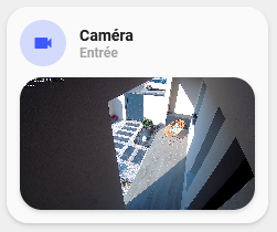
Custom-card "Camera"
This is a custom-card to display a camera live view.
Credits
Author: Eltarius, from the script of Clemalex - 2022 Version: 1.0.0
Changelog
1.0.1
Added variable to passthrough aspect ratio to the picture entity card. Fix minor issues with title.1.0.0
Initial release.Usage
- type: "custom:button-card"
  entity: "camera.sensor"
  template: "custom_card_camera"
  show_icon: false #True if you set ulm_custom_card_camera_title: true
  variables:
    ulm_custom_card_camera_title: true
    ulm_custom_card_camera_name: "name"
    ulm_custom_card_camera_label: "label"
    ulm_custom_card_camera_aspect_ratio: "16:9"
Variables
| Variable | Example | Required | Default | Explanation |
|---|---|---|---|---|
| ulm_custom_card_camera_title | true | yes | If you want header card | |
| ulm_custom_card_camera_name | "Garden" | no | Name of your choice | |
| ulm_custom_card_camera_label | "Room" | no | Label of your choice | |
| ulm_custom_card_camera_aspect_ratio | '16:9' | no | Aspect ratio of camera entity |
Template Code
custom_card_camera.yaml
---
custom_card_camera:
  template:
    - "blue_no_state"
  show_name: false
  show_label: false
  styles:
    card:
      - border-radius: "20px"
      - box-shadow: "var(--box-shadow)"
      - padding: |-
          [[[
            if(variables.ulm_custom_card_camera_title)
              return "12px";
            else
              return "0px";
          ]]]
    img_cell:
      - border-radius: "50%"
      - place-self: "center"
      - width: "42px"
      - height: "42px"
    grid:
      - grid-template-areas: "'i item1' 'i item1' 'item2 item2'"
      - grid-template-columns: "min-content auto"
      - grid-template-rows: "min-content min-content min-content"
      - row-gap: |-
          [[[
            if(variables.ulm_custom_card_camera_title)
              return "12px";
            else
              return "0px";
          ]]]
  custom_fields:
    item1:
      card:
        type: "custom:button-card"
        show_name: "[[[ return variables.ulm_custom_card_camera_title; ]]]"
        show_label: "[[[ return variables.ulm_custom_card_camera_title; ]]]"
        show_icon: "[[[ return variables.ulm_custom_card_camera_title; ]]]"
        name: "[[[ return variables.ulm_custom_card_camera_name; ]]]"
        label: "[[[ return variables.ulm_custom_card_camera_label; ]]]"
        tap_action:
          action: "more-info"
          entity: "[[[ return entity.entity_id ]]]"
        styles:
          card:
            - box-shadow: "none"
            - padding: "0"
            - --mdc-ripple-press-opacity: 0
          name:
            - align-self: "end"
            - justify-self: "start"
            - font-weight: "bold"
            - font-size: "14px"
            - margin-left: "12px"
            - filter: "opacity(100%)"
          label:
            - justify-self: "start"
            - align-self: "start"
            - font-weight: "bolder"
            - font-size: "12px"
            - filter: "opacity(40%)"
            - margin-left: "12px"
          grid:
            - grid-template-areas: "'n' 'l'"
            - grid-template-columns: "auto"
            - grid-template-rows: "min-content min-content"
    item2:
      card:
        type: "picture-entity"
        camera_image: "[[[ return entity.entity_id ]]]"
        camera_view: "live"
        entity: "[[[ return entity.entity_id ]]]"
        show_name: false
        show_state: false
        aspect_ratio: "[[[ return variables.ulm_custom_card_camera_aspect_ratio; ]]]"
  tap_action:
    action: "more-info"