Custom-card "Flower"
This is a custom-card to display a plant entity. Shows state of the plant and attributes.
Credits
- Author: schumijo - 2021
- Update 2.0.0 : Ashino - 2024
- Version: 2.0.0
Changelog
1.0.0
Initial release1.1.0
Fix language files for beta5 Updated README2.0.0
Add support to lovelace-flower-card from Olen (advanced forked version) Updated READMEUsage
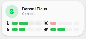
- type: "custom:button-card"
  template: card_flower
  variables:
    ulm_card_flower_entity: plant.bonsai_ficus
    ulm_card_flower_name: Bonsai Ficus
    ulm_card_flower_species: "ficus retusa"
    ulm_card_flower_show_bars:
        - temperature
        - humidity
        - moisture
Variables
| Variable | Example | Required | Explanation |
|---|---|---|---|
| ulm_card_flower_entity | plant.bonsai_ficus | yes | The entity of your plant |
| ulm_card_flower_name | Bonsai Ficus | no | The name of your plant |
| ulm_card_flower_species | "ficus retusa" | yes | The species of your plant |
| ulm_card_flower_show_bars |
- temperature
- moisture - humidity |
no | The bar you want to display. Any of :
|
Requirements
Need lovelace-flower-card
Template code
Template Code
custom_card_schumijo_flower.yaml
---
list_1_item:
  styles:
    card:
      - box-shadow: "none"
      - padding: "0px"
    grid:
      - grid-template-areas: "'item1'"
      - grid-template-columns: "1fr"
      - grid-template-rows: "min-content"
      - column-gap: "7px"

flower:
  template:
    - "ulm_custom_card_schumijo_flower_language_variables"
  tap_action:
    action: "more-info"
  icon: |
    [[[
        var icon = 'mdi:flower';
        if (entity.state == 'problem'){
          var icon = 'mdi:alert-circle';
        }
        return icon ;
    ]]]
  label: >-
    [[[
        if (entity.state == 'problem'){
          return variables.ulm_custom_card_schumijo_flower_problem;
        }else{
          return variables.ulm_custom_card_schumijo_flower_correct;
        }
    ]]]
  state:
    - operator: "template"
      value: >
        [[[
          return entity.state != 'on';
        ]]]
      styles:
        icon:
          - color: "rgba(var(--color-green),1)"
        img_cell:
          - background-color: "rgba(var(--color-green),0.2)"

card_flower:
  variables:
    ulm_card_flower_name: "No name set"
  styles:
    card:
      - border-radius: "20px"
      - box-shadow: "var(--box-shadow)"
      - padding: "12px"
    grid:
      - grid-template-areas: "'item1' 'item2'"
      - grid-template-columns: "1fr"
      - grid-template-rows: "min-content  min-content"
      - row-gap: "6px"
  custom_fields:
    item1:
      card:
        entity: "[[[ return variables.ulm_card_flower_entity ]]]"
        name: "[[[ return variables.ulm_card_flower_name ]]]"
        tap_action:
          action: "more-info"
        template:
          - "icon_info"
          - "flower"
        type: "custom:button-card"
    item2:
      card:
        template: "list_1_item"
        type: "custom:button-card"
        custom_fields:
          item1:
            card:
              type: "custom:flower-card"
              entity: "[[[ return variables.ulm_card_flower_entity ]]]"
              species: "[[[ return variables.ulm_card_flower_species ]]]"
              show_bars: "[[[ return variables.ulm_card_flower_show_bars ]]]"
              card_mod:
                style: |
                  ha-card{
                    margin-top: 0px !important;
                    box-shadow: none !important;
                    --mdc-icon-size: 16px !important;
                  }
                  .header{
                    display: none !important;
                  }
                  .divider{
                    display: none !important;
                  }
                  .value{
                    display: none !important;
                  }
                  .attributes{
                    padding: 0px !important;
                  }
                  .attribute ha-icon {
                      margin-right: 0px !important;
                  }