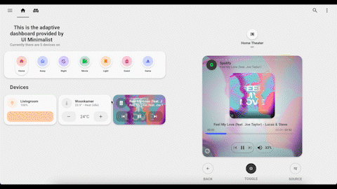
Adaptive Dashboard
Add Adaptive Dashboard
To get full use of your Minimalist themed HA you need to setup some more custom_components (see requirements below).
This dashboard automatically changes based on the device/screen size your are using. You can also alter the cards showing on the right-side by double-tapping a card. (Steps to configure this are described below)
Additional Requirements
This dashboard make extensive use of state-switch and layout-card. These are available through HACS or as manual install from Github.
Warning
For now the state-switch works only with version v1.9.3 or below!
| Additional lovelace resources |
|---|
layout-card |
state-switch |
You need also configure an input_select with options for each popup_card and view you have configured. This input_select controls the cards showing on the right-side of the screen when in fullscreen mode.
Popups
Note: Not all device types do have Minimalist UI themed popups.
Currently supported devices are: lights, mediaplayers, thermostats, sensors.
You can setup an input_select either via the GUI or in YAML. See HA docs
# Example configuration.yaml entry
input_select:
  minimalist_ui_switch:
    name: Select popup/view
    options:
      - light 1
      - light 2
      - mediaplayer 1
      - mediaplayer 2
      - climate 1
      - climate 2
      - power 1
      - power 2
      - livingroom
Setup
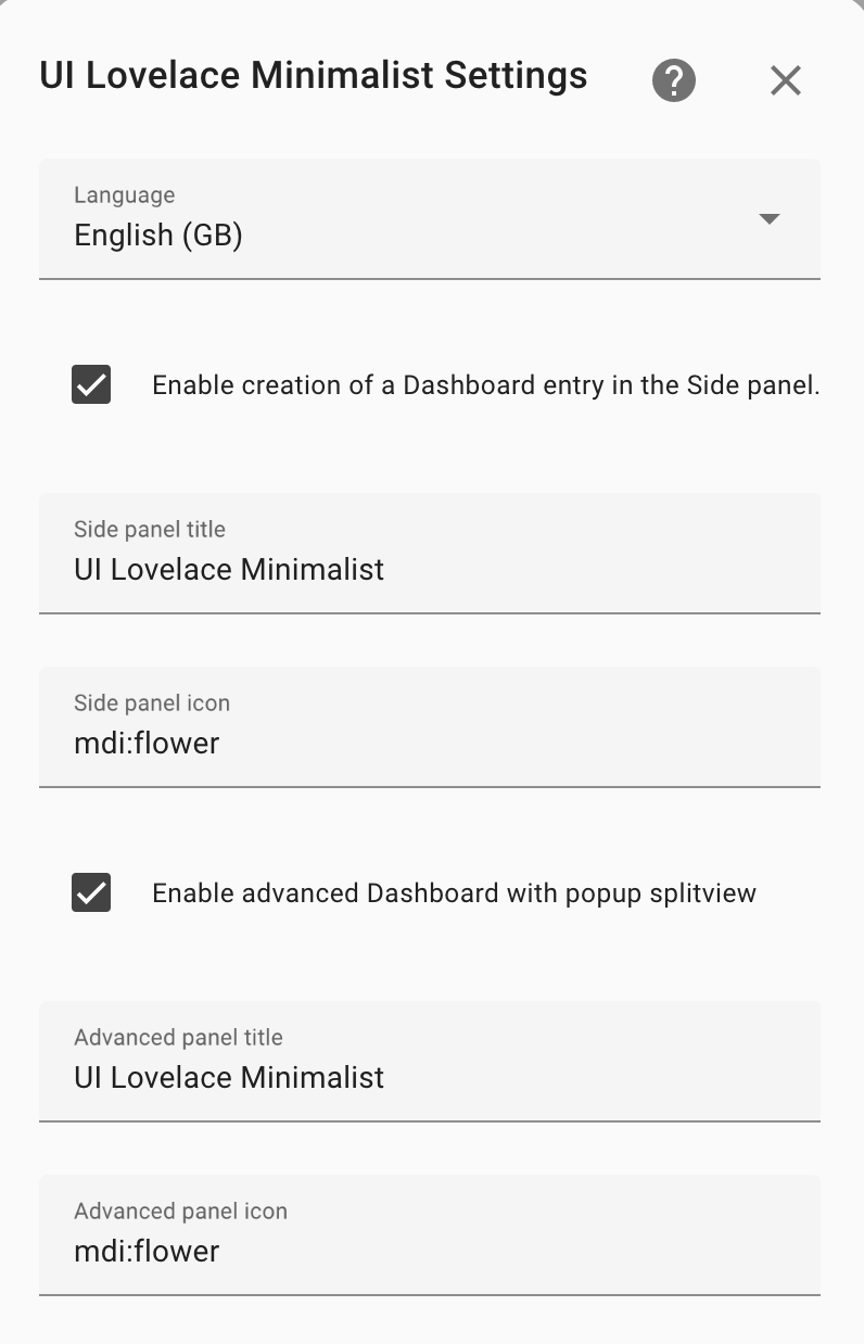
To enable the adaptive dashboard you need to select the right option in the integration configuration menu. You can also set a name and icon for the new dashboard.
Once setup you should see another dashboard in your sidebar. This dashboard is filled with card_title template cards as placeholders on the pre-configured grid.
We have also added a folder with all the needed files to customizing your new dashboard:
config
└── ui_lovelace_minimalist
├── custom_cards
└── dashboard
└── ui-lovelace.yaml
└── adaptive-dash
└── adaptive-ui.yaml
└── popup
└── popup.yaml
└── views
└── livingroom.yaml
└── main.yaml
Customizing
The best place to start adding your personal cards is in adaptive-dash/views/main.yaml.
Grid-Layout
All files use CSS grids. By giving each card an own grid-area we can control there place in the dashboard. For more information on how grid-areas do work check this amazing guide.
When you are familiar with CSS grids you can start to alter the grid-template-areas to your personal preference.
Adding Cards
You can assign cards to a certain grid-area by adding this to your card configuration. We already have put in this config for some cards and titles.
view_layout:
  grid-area: "card1"
To put card_light to the area: card1; you have to paste in the code as in your normal Minimalist UI dashboard on the place of the placeholder.
# Placeholder for card1 in main.yaml
- view_layout:
    grid-area: "card1"
  type: "custom:button-card"
  template: "card_title"
  name: "Put here your <br> first card"
  label: "grid-area: card1"
# Example of a card_light assigned to area card1
- view_layout:
    grid-area: "card1"
  type: "custom:button-card"
  template: "card_light"
  entity: "light.your_light"
  variables:
    ulm_card_light_enable_color: true
    ulm_card_light_enable_slider: true
    ulm_card_light_enable_popup: true
Do this for all placeholders. You can always use less cards by deleting placeholders or add more cards by adding new areas under the grid-template-areas.
For adapting the action use adaptive within the corresponding custom actions' variables. Take a look in the
custom actions section within this docs.
Adding popups on the right-side
All cards on the right-side are configured in adaptive-dash/popup/popup.yaml.
First you need to add the input_select you have created to the file.
Important
type: custom:state-switch
view_layout:
  grid-area: popup
  show:
    mediaquery: "(min-width: 1100px)"
entity: input_select.minimalist_ui # put your input_select here
We preconfigured multiple popups for different types of devices. In popup.yaml you only have to complete the information in the variables part. The light 1, mediaplayer 1, livingroom parts in the code refer to the options you have configured in your input_select. Make sure they are spelled the same. (see documentation on state-switch)
Warning
Only uncomment the options you have configured! Else it could result in multiple errors in the dev-console of your browser.
Follow this part to add a card to an option of your input_select:
To add a light popup to your first light card you just have to add the corresponding entity:
type: custom:state-switch
view_layout:
  grid-area: popup
  show:
    mediaquery: "(min-width: 1100px)"
entity: input_select.minimalist_ui # put your input_select here
default: default
transition: slide-down
transition_time: 500
states:
  ## Lights
  light 1:
    type: "custom:button-card"
    template: "popup_light_brightness"
    entity: "<your_entity>"
You can also add any other card by copying its yaml code in without the hyphen (-)
states:
  ## Lights
  light 1:
    type: "custom:button-card"
    template: "popup_light_brightness"
    entity: "<your_entity>"
  card 1:
    type: "custom:button-card"
    template: "<your_template>"
Important!
All options(devices) do need its own config in popup.yaml!
To switch between popups we need to go back to adaptive-dash/views/main.yaml. Here we have to add two variables to the cards we want to show a popup off. After adding these variables the cards need to be double_tapped to change popups.
variables:
  ulm_input_select_option: light 1
  ulm_input_select: input_select.minimalist_ui_switch
Eventually the card_light we did configure should be like this:
- view_layout:
    grid-area: "card1"
  type: "custom:button-card"
  template: "card_light"
  entity: "light.your_light"
  variables:
    ulm_card_light_enable_color: true
    ulm_card_light_enable_slider: true
    ulm_card_light_enable_popup: true
    ulm_input_select_option: light 1
    ulm_input_select: input_select.minimalist_ui_switch
From here you can duplicate the steps for each card.
Supported
All cards working with official popups and the card_room support these variables. The name is uniform between all supported cards.
Setup more views
We already made a file for a second view: adaptive-dash/views/livingroom.yaml. You can make as many views as you want by duplicating and alter the views files.
To make the new view visible you have to add some entry to adaptive-dash/adaptive-ui.yaml. You only have to change the name of the room/view to the new entry.
Add an extra view example (click to open)
title: "UI Lovelace Minimalist"
theme: "minimalist-desktop"
background: "var(--background-image)"
views:
  - type: "custom:grid-layout"
    title: "home"
    icon: "mdi:home"
    path: "0"
    layout:
    grid-template-columns: "1fr 1fr"
    grid-template-rows: "min-content"
    grid-template-areas: |
        "main popup"
    mediaquery:
        "(max-width: 1100px), (orientation: portrait)":
        grid-template-columns: "100%"
        grid-template-areas: "main"
    cards:
    - !include "views/main.yaml"
    - !include "popup/popup.yaml"

  - type: "custom:grid-layout"
    title: "Livingroom"
    icon: "mdi:sofa"
    path: "Livingroom"
    layout:
    grid-template-columns: "1fr 1fr"
    grid-template-rows: "min-content"
    grid-template-areas: |
        "livingroom popup"
    mediaquery:
        "(max-width: 1100px), (orientation: portrait)":
        grid-template-columns: "100%"
        grid-template-areas: "livingroom"
    cards:
    - !include "views/livingroom.yaml"
    - !include "popup/popup.yaml"

  - type: "custom:grid-layout"
    title: "New View"
    icon: "mdi:flower"
    path: "New View"
    layout:
    grid-template-columns: "1fr 1fr"
    grid-template-rows: "min-content"
    grid-template-areas: |
        "new_view popup"
    mediaquery:
        "(max-width: 1100px), (orientation: portrait)":
        grid-template-columns: "100%"
        grid-template-areas: "newview"
    cards:
    - !include "views/newview.yaml"
    - !include "popup/popup.yaml"
You can also show room views as a popup. To configure this add a !include entry in the popup.yaml file. As example we configured livingroom already. Make sure this is also an option in your input_select.
# Add livingroom popup to popup.yaml
livingroom: !include "../views/livingroom.yaml"
Also add the two variables to the corresponding card_room:
variables:
  ulm_input_select_option: livingroom
  ulm_input_select: input_select.minimalist_ui_switch