Custom Card "Welcome Navigation"
Credits
- Author: Everything Smart Home - 2022
- Credits to the welcome scenes card as the basis
- Version: 1.1.0
Changelog
1.1.0
- Now support from 0-5 navigation pill.
- Added dynamic nav pill size.
- Code refactoring to fit framework structure.
- Code clean up.
Contributor: Sisimomo - 2022-06-12
1.0.0
Initial releaseDescription
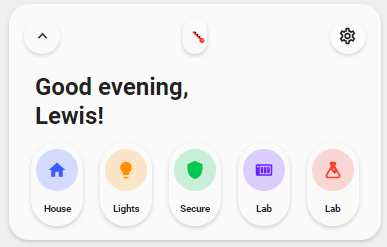
This is a welcome card based on the welcome scenes card but replaces the scenes for page navigation instead.
Variables
| Variable | Default | Required | Notes |
|---|---|---|---|
| ulm_card_esh_welcome_collapse | No | Enables the collapse function. requires an input_boolean to track the state |
|
| ulm_weather | Yes | This is your weather provider. Example: weather.your_provider |
|
| entity_ | Yes | Support almost all types of entities Scenes do always show as off |
|
| icon_ | Yes | The icon to show | |
| name_ | Yes | The name to show | |
| color_ | Yes | Color of the icon Can choose between: blue, red, green, yellow, pink, purple |
|
| nav_ | Yes | The page/view to navigate to |
Collapse
Note
This feature is fully optional. It requires some more manual configuration!
You need to create a input_boolean in HA to track the state. See Docs.
Furthermore, you need to add the input_boolean to the variable ulm_card_esh_welcome_collapse and to either the entity or triggers_update to make sure it directly refreshes the state.
Warning
Do not use triggers_update: "all"! This will lead to unwanted behavior with the random colors generator.
Usage
- type: "custom:button-card"
  template: "card_esh_welcome"
  triggers_update: "input_boolean.welcome_toggle"
  variables:
    ulm_card_esh_welcome_collapse: input_boolean.welcome_toggle
    ulm_weather: "weather.your_weather"
    entity_1:
      nav: "house"
      icon: "mdi:home"
      name: "House"
      color: "blue"
    entity_2:
      nav: "lights"
      icon: "mdi:lightbulb"
      name: "Lights"
      color: "yellow"
    entity_3:
      nav: "security"
      icon: "mdi:shield"
      name: Secure
      color: "green"
    entity_4:
      nav: "network"
      icon: "mdi:nas"
      name: Lab
      color: "purple"
    entity_5:
      nav: "network"
      icon: "mdi:flask"
      name: Lab
      color: "red"
Template code
Template Code
custom_card_esh_welcome.yaml
---
card_esh_welcome:
  template: "ulm_language_variables"
  variables:
    ulm_weather: "[[[ return variables.ulm_weather]]]"
    entity_1:
      color: >
        [[[
          var colors = ['yellow', 'blue', 'red', 'purple','green', 'pink'];
          var color = colors[Math.floor(Math.random() * colors.length)];
          return color;
        ]]]
    entity_2:
      color: >
        [[[
          var colors = ['yellow', 'blue', 'red', 'purple','green', 'pink'];
          var color = colors[Math.floor(Math.random() * colors.length)];
          return color;
        ]]]
    entity_3:
      color: >
        [[[
          var colors = ['yellow', 'blue', 'red', 'purple','green', 'pink'];
          var color = colors[Math.floor(Math.random() * colors.length)];
          return color;
        ]]]
    entity_4:
      color: >
        [[[
          var colors = ['yellow', 'blue', 'red', 'purple','green', 'pink'];
          var color = colors[Math.floor(Math.random() * colors.length)];
          return color;
        ]]]
    entity_5:
      color: >
        [[[
          var colors = ['yellow', 'blue', 'red', 'purple','green', 'pink'];
          var color = colors[Math.floor(Math.random() * colors.length)];
          return color;
        ]]]
  show_icon: false
  show_label: true
  show_name: false
  styles:
    grid:
      - grid-template-areas: >
          [[[
            if(variables.ulm_card_esh_welcome_collapse && states[variables.ulm_card_esh_welcome_collapse].state == 'on'){
              return "\'item1\' \'item2\' ";
            } else {
              return "\'item1\' \'item2\' \'item3\'";
            }
          ]]]
      - grid-template-columns: "1fr"
      - grid-template-rows: "min-content min-content"
      - row-gap: "0px"
    card:
      - border-radius: "var(--border-radius)"
      - box-shadow: "var(--box-shadow)"
      - padding: "10px"
      - cursor: "default"
      - "--mdc-ripple-press-opacity": 0   # prevent click animation
    custom_fields:
      item3:
        - display: >
            [[[
              if(variables.ulm_card_esh_welcome_collapse && states[variables.ulm_card_esh_welcome_collapse].state == 'on'){
                return "none";
              } else {
                return "block";
              }
            ]]]
      item4:
        - display: >
            [[[
              if(variables.ulm_card_esh_welcome_collapse && states[variables.ulm_card_esh_welcome_collapse].state == 'on'){
                return "none";
              } else {
                return "block";
              }
            ]]]
  custom_fields:
    item1:
      card:
        type: "custom:button-card"
        template: "card_esh_welcome_topbar"
        variables:
          ulm_card_esh_welcome_collapse: "[[[ return variables.ulm_card_esh_welcome_collapse ]]]"
          ulm_weather: "[[[ return variables.ulm_weather]]]"
        styles:
          card:
            - border-radius: "none"
            - box-shadow: "none"
            - padding: "4px"
            - margin-left: "relative"
            - cursor: "default"
            - "--mdc-ripple-press-opacity": 0   # prevent click animation
    item2:
      card:
        type: "custom:button-card"
        show_icon: false
        show_label: false
        show_name: true
        show_entity_picture: false
        name: |
          [[[
            var today = new Date();
            var time = today.getHours()
            let welcome = '';
            if (time >= '18'){
              welcome = variables.ulm_evening;
            } else if (time >= '12'){
              welcome = variables.ulm_afternoon;
            } else if (time >= '5'){
              welcome = variables.ulm_morning;
            } else {
              welcome = variables.ulm_hello;
            }
            return welcome + ', ' + '   <br>' + user.name + '!';
          ]]]
        styles:
          name:
            - align-self: "start"
            - justify-self: "start"
            - font-weight: "bold"
            - font-size: "24px"
            - margin-left: "16px"
          grid:
            - grid-template-areas: "'i n' 'i l'"
            - grid-template-columns: "min-content auto"
            - grid-template-rows: "min-content min-content"
            - text-align: "start"
          card:
            - box-shadow: "none"
            - padding-bottom: "8px"
            - cursor: "default"
            - "--mdc-ripple-press-opacity": 0   # prevent click animation
    item3:
      card:
        type: "custom:button-card"
        template: "card_esh_welcome_nav"
        styles:
          card:
            - border-radius: "none"
            - box-shadow: "none"
            - padding: "4px"
            - cursor: "default"
            - "--mdc-ripple-press-opacity": 0   # prevent click animation
        variables:
          entity_1: "[[[ return variables.entity_1 ]]]"
          entity_2: "[[[ return variables.entity_2 ]]]"
          entity_3: "[[[ return variables.entity_3 ]]]"
          entity_4: "[[[ return variables.entity_4 ]]]"
          entity_5: "[[[ return variables.entity_5 ]]]"

card_esh_welcome_title:
  tap_action:
    action: "none"
  show_icon: false
  show_label: true
  show_name: true
  styles:
    label:
      - justify-self: "start"
      - font-weight: "bold"
      - font-size: "1rem"
      - opacity: "0.4"
    name:
      - justify-self: "start"
      - font-weight: "bold"
      - font-size: "20px"
    grid:
      - grid-template-areas: "'n' 'l'"
      - grid-template-columns: "1fr"
      - grid-template-rows: "min-content min-content"
    card:
      - background-color: "rgba(0,0,0,0)"
      - box-shadow: "none"
      - height: "auto"
      - width: "auto"
      - margin-top: "-10px"
      - margin-left: "16px"
      - margin-bottom: "-15px"
      - cursor: "default"
      - "--mdc-ripple-press-opacity": 0   # prevent click animation

card_esh_welcome_nav:
  show_icon: false
  show_name: true
  show_label: false
  styles:
    grid:
      - grid-template-areas: |
          [[[
            return "'" + [(variables.entity_1?.nav ? 'item1' : ''),
                        (variables.entity_2?.nav ? 'item2' : ''),
                        (variables.entity_3?.nav ? 'item3' : ''),
                        (variables.entity_4?.nav ? 'item4' : ''),
                        (variables.entity_5?.nav ? 'item5' : '')].join(' ') + "'";
          ]]]
      - grid-template-columns: |
          [[[
            return [(variables.entity_1?.nav ? '1fr' : ''),
                    (variables.entity_2?.nav ? '1fr' : ''),
                    (variables.entity_3?.nav ? '1fr' : ''),
                    (variables.entity_4?.nav ? '1fr' : ''),
                    (variables.entity_5?.nav ? '1fr' : '')].join(' ');
          ]]]
      - grid-template-rows: "min-content"
      - justify-items: "center"
    card:
      - border-radius: "var(--border-radius)"
      - box-shadow: "var(--box-shadow)"
      - padding: "12px"
      - overflow: "visible"
  custom_fields:
    item1:
      card:
        type: "custom:button-card"
        template: "card_esh_welcome_pill_nav"
        variables:
          number_of_nav_pills: |
            [[[
              return [variables.entity_1?.nav,
                      variables.entity_2?.nav,
                      variables.entity_3?.nav,
                      variables.entity_4?.nav,
                      variables.entity_5?.nav].filter(el => el !== undefined).length;
            ]]]
          entity: "[[[ return variables.entity_1; ]]]"
    item2:
      card:
        type: "custom:button-card"
        template: "card_esh_welcome_pill_nav"
        variables:
          number_of_nav_pills: |
            [[[
              return [variables.entity_1?.nav,
                      variables.entity_2?.nav,
                      variables.entity_3?.nav,
                      variables.entity_4?.nav,
                      variables.entity_5?.nav].filter(el => el !== undefined).length;
            ]]]
          entity: "[[[ return variables.entity_2; ]]]"
    item3:
      card:
        type: "custom:button-card"
        template: "card_esh_welcome_pill_nav"
        variables:
          number_of_nav_pills: |
            [[[
              return [variables.entity_1?.nav,
                      variables.entity_2?.nav,
                      variables.entity_3?.nav,
                      variables.entity_4?.nav,
                      variables.entity_5?.nav].filter(el => el !== undefined).length;
            ]]]
          entity: "[[[ return variables.entity_3; ]]]"
    item4:
      card:
        type: "custom:button-card"
        template: "card_esh_welcome_pill_nav"
        variables:
          number_of_nav_pills: |
            [[[
              return [variables.entity_1?.nav,
                      variables.entity_2?.nav,
                      variables.entity_3?.nav,
                      variables.entity_4?.nav,
                      variables.entity_5?.nav].filter(el => el !== undefined).length;
            ]]]
          entity: "[[[ return variables.entity_4; ]]]"
    item5:
      card:
        type: "custom:button-card"
        template: "card_esh_welcome_pill_nav"
        variables:
          number_of_nav_pills: |
            [[[
              return [variables.entity_1?.nav,
                      variables.entity_2?.nav,
                      variables.entity_3?.nav,
                      variables.entity_4?.nav,
                      variables.entity_5?.nav].filter(el => el !== undefined).length;
            ]]]
          entity: "[[[ return variables.entity_5; ]]]"

card_esh_welcome_pill_nav:
  tap_action:
    action: "navigate"
    navigation_path: "[[[ return variables.entity?.nav; ]]]"
  show_icon: false
  show_label: false
  show_name: false
  state:
    - operator: "template"
      value: "[[[ return !variables.entity?.nav; ]]]"
      styles:
        card:
          - display: "none"
  styles:
    grid:
      - grid-template-areas: "'item1' 'item2'"
      - grid-template-columns: "1fr"
      - grid-template-rows: "1fr 1fr"
      - row-gap: "12px"
      - justify-items: "center"
      - column-gap: "auto"
    card:
      - border-radius: "50px"
      - place-self: "center"
      - width: "[[[ return (52 * (1+(5-Math.max(variables.number_of_nav_pills, 3))*0.25)) + 'px'; ]]]"
      - height: "[[[ return (84 * (1+(5-Math.max(variables.number_of_nav_pills, 3))*0.25)) + 'px'; ]]]"
      - box-shadow: >
          [[[
            if (hass.themes.darkMode){
              return "0px 2px 4px 0px rgba(0,0,0,0.80)";
            } else {
              return "var(--box-shadow)";
            }
          ]]]
      - "--mdc-ripple-press-opacity": 0.12    # allow click animation
  color: "var(--google-grey)"
  custom_fields:
    item1:
      card:
        type: "custom:button-card"
        tap_action:
          action: "navigate"
          navigation_path: "[[[ return variables.entity?.nav; ]]]"
        show_icon: true
        show_label: false
        show_name: false
        icon: "[[[ return variables.entity?.icon ]]]"
        styles:
          icon:
            - color: "[[[ return `rgba(var(--color-${variables.entity?.color}), 1)`;]]]"
            - width: "[[[ return (20 * (1+(5-Math.max(variables.number_of_nav_pills, 3))*0.25)) + 'px'; ]]]"
          img_cell:
            - background-color: "[[[ return `rgba(var(--color-${variables.entity?.color}), 0.20)`;]]]"
            - border-radius: "50%"
            - width: "[[[ return (42 * (1+(5-Math.max(variables.number_of_nav_pills, 3))*0.25)) + 'px'; ]]]"
            - height: "[[[ return (42 * (1+(5-Math.max(variables.number_of_nav_pills, 3))*0.25)) + 'px'; ]]]"
          grid:
            - grid-template-areas: "i"
          card:
            - box-shadow: "none"
            - border-radius: "50px"
            - padding: "5px"
        state:
          - value: "on"
            styles:
              card:
                - overflow: "visible"
                - box-shadow: |
                    [[[
                      if (hass.themes.darkMode){
                        return "0px 2px 4px 0px rgba(0,0,0,0.80)";
                      } else {
                        return "var(--box-shadow)";
                      }
                    ]]]
    item2:
      card:
        type: "custom:button-card"
        tap_action:
          action: "navigate"
          navigation_path: "[[[ return variables.entity?.nav; ]]]"
        show_icon: false
        show_label: false
        name: "[[[ return variables.entity?.name ]]]"
        styles:
          name:
            - font-weight: "bold"
            - font-size: "[[[ return (9.5 * (1+(5-Math.max(variables.number_of_nav_pills, 3))*0.25)) + 'px'; ]]]"
            - width: "[[[ return (33 * (1+(5-Math.max(variables.number_of_nav_pills, 3))*0.25)) + 'px'; ]]]"
            - padding-bottom: "7px"
          grid:
            - grid-template-areas: "n"
          card:
            - box-shadow: "none"
            - padding: "0px 5px 5px 5px"
            - margin-top: "-5px"
            - border-radius: "50px"

card_esh_welcome_topbar:
  show_icon: false
  show_label: false
  show_name: true
  styles:
    grid:
      - grid-template-areas: "'item1 item2 item3'"
      - grid-template-columns: "1fr 7fr 1fr"
      - grid-template-rows: "min-content"
      - justify-items: "center"
    card:
      - border-radius: "var(--border-radius)"
      - box-shadow: "var(--box-shadow)"
      - padding: "12px"
      - cursor: "default"
      - "--mdc-ripple-press-opacity": 0   # prevent click animation
  custom_fields:
    item1:
      card:
        type: "custom:button-card"
        template: "chips"
        tap_action:
          action: "perform-action"
          perform_action: "input_boolean.toggle"
          target:
            entity_id: "[[[ return variables.ulm_card_esh_welcome_collapse ]]]"
        show_icon: true
        icon: "mdi:chevron-up"
        entity: "[[[ return variables.ulm_card_esh_welcome_collapse ]]]"
        styles:
          grid:
            - grid-template-areas: "'i'"
          card:
            - box-shadow: >
                [[[
                  if (hass.themes.darkMode){
                    return "0px 2px 4px 0px rgba(0,0,0,0.80)";
                  } else {
                    return "var(--box-shadow)";
                  }
                ]]]
            - visibility: "[[[ return variables.ulm_card_esh_welcome_collapse ? 'visible' : 'hidden'; ]]]"
            - "--mdc-ripple-press-opacity": 0.12    # allow click animation
        state:
          - value: "on"
            icon: "mdi:chevron-down"
            styles:
              icon:
                - color: "rgb(var(--color-theme))"
    item2:
      card:
        type: "custom:button-card"
        template: "chip_weather_date"
        variables:
          ulm_weather: "[[[ return variables.ulm_weather]]]"
        tap_action:
          action: "more-info"
        entity: "[[[ return variables.ulm_weather]]]"
        styles:
          card:
            - width: "100px"
            - box-shadow: >
                [[[
                  if (hass.themes.darkMode){
                    return "0px 2px 4px 0px rgba(0,0,0,0.80)";
                  } else {
                    return "var(--box-shadow)";
                  }
                ]]]
            - "--mdc-ripple-press-opacity": 0.12    # allow click animation
    item3:
      card:
        type: "custom:button-card"
        template: "chip_mdi_icon_only"
        variables:
          ulm_chip_mdi_icon_only_icon: "mdi:cog-outline"
        tap_action:
          action: "navigate"
          navigation_path: "/config/dashboard"
        styles:
          card:
            - align-self: "end"
            - box-shadow: >
                [[[
                  if (hass.themes.darkMode){
                    return "0px 2px 4px 0px rgba(0,0,0,0.80)";
                  } else {
                    return "var(--box-shadow)";
                  }
                ]]]
            - "--mdc-ripple-press-opacity": 0.12    # allow click animation