Light Card
Description
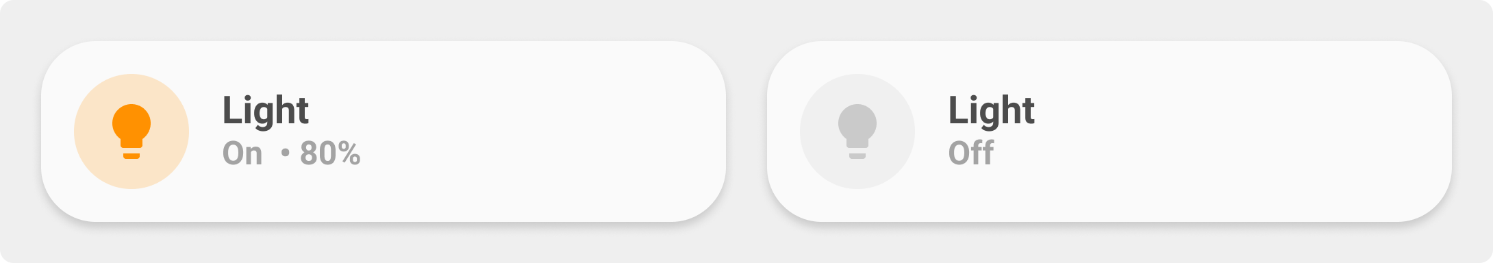
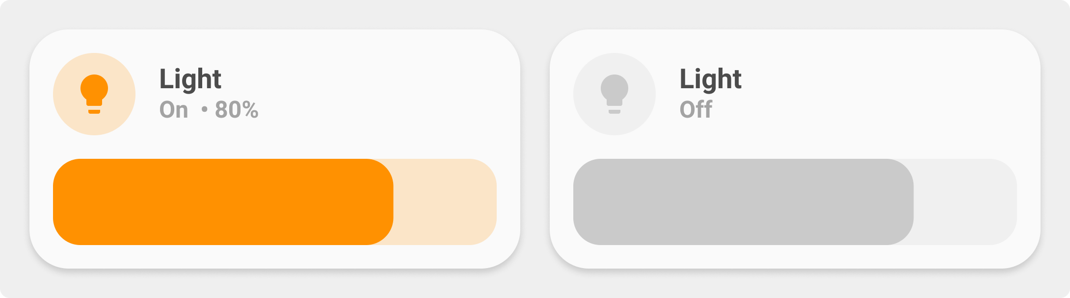
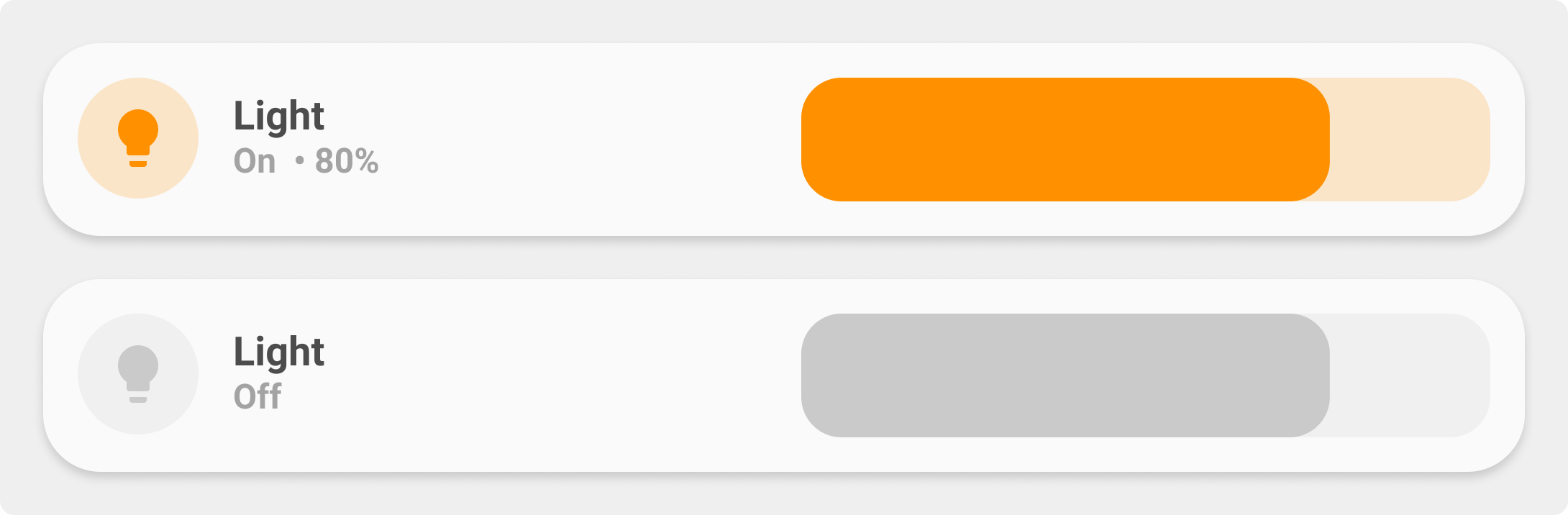
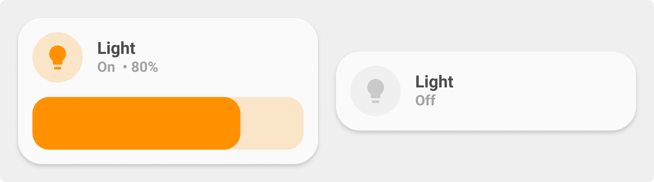
This is the light-card, used to toggle a light or a light group. Shows state of the light and, if available, brightness in %.
This documentation refers to the new "All in one" light card. This card merges the following one :
- legacy
card_light(the old one) - legacy
card_light_slider - legacy
card_light_slider_collapse - legacy
card_light_slider_horizontal - custom
card_light_colorby basbruss - custom
card_light_horizontal_colorby basbruss - custom
card_light_slider_colorby basbruss - custom
card_light_slider_collapse_colorby basbruss
Warning
This card has backward compatibility with older template except custom names and icons. It means variables like ulm_card_XXX_name and ulm_card_XXX_icon must be replaced by ulm_card_light_name and ulm_card_light_icon.
To use popup_light you need to set the variable ulm_card_light_enable_popup to true. This is a different approach as the other popup_cards use.
Variables
| Variable/Entity | Default | Required | Notes | Requirement |
|---|---|---|---|---|
| entity | Your HA entity | |||
| ulm_card_light_name | friendly_name |
Customize name | ||
| ulm_card_light_icon | mdi:lightbulb |
Customize icon | ||
| ulm_card_light_enable_slider | false |
Enable slider | ||
| ulm_card_light_enable_slider_minSet | 0 |
Minimum brightness value user can select in the slider | Need ulm_card_light_enable_slider: true |
|
| ulm_card_light_enable_slider_maxSet | 100 |
Maximum brightness value user can select in the slider | Need ulm_card_light_enable_slider: true |
|
| ulm_card_light_enable_collapse | false |
Collapse slider when off | Need ulm_card_light_enable_slider: true |
|
| ulm_card_light_enable_horizontal | false |
Enable horizontal card | ||
| ulm_card_light_enable_horizontal_wide | false |
Wider slider | Need ulm_card_light_enable_horizontal: true |
|
| ulm_card_light_color | yellow |
Set a manual color from the theme for icon, slider and background | ||
| ulm_card_light_enable_color | false |
Enable icon and label light color from the light itself. | Overrides ulm_card_light_color |
|
| ulm_card_light_force_background_color | false |
Force background light color even in light theme | ||
| ulm_card_light_enable_popup | false |
Enable popup_light |
||
| ulm_card_light_enable_popup_tap | false |
Enable popup_light on simple icon tap |
||
| ulm_card_light_color_palette | Add select entity to control color palette |
|||
| ulm_card_light_enable_buttons | false |
Enable Preset Brightness Buttons | ||
| ulm_card_light_brightness_low/medium/high | Override the Brightness defaults for Buttons - Percentages |
Usage
- type: "custom:button-card"
  template: card_light
  entity: light.allee
  variables:
    ulm_card_light_enable_slider: true
    ulm_card_light_enable_color: true
    ulm_card_light_force_background_color: true
Template Code
card_light.yaml
---
### Card Light ###
card_light:
template:
- "icon_more_info_new"
- "ulm_translation_engine"
variables:
ulm_card_light_name: "[[[ return entity.attributes.friendly_name ]]]"
ulm_card_light_icon: "[[[ return entity.attributes.icon ]]]"
ulm_card_light_enable_collapse: false
ulm_card_light_enable_horizontal: false
ulm_card_light_enable_horizontal_wide: false
ulm_card_light_enable_color: false
ulm_card_light_color_palette: ""
ulm_card_light_color: "yellow"
ulm_card_light_force_background_color: false
ulm_card_light_enable_slider: false
ulm_card_light_enable_slider_minSet: 0
ulm_card_light_enable_slider_maxSet: 100
ulm_card_light_enable_buttons: false
ulm_card_light_brightness_low: 1
ulm_card_light_brightness_medium: 50
ulm_card_light_brightness_high: 100
ulm_card_light_enable_popup: false
ulm_card_light_enable_popup_tap: false
show_icon: false
show_name: false
show_label: false
state:
- operator: "template"
value: "[[[ return variables.ulm_active_state ]]]"
styles:
card:
- background-color: >
[[[
var color_set = (variables.ulm_card_light_enable_color && entity.attributes.rgb_color) ? entity.attributes.rgb_color : variables.ulm_card_light_color;
var color = 'rgba(var(--color-' + color_set + '),var(--opacity-bg))'
if(variables.ulm_card_light_enable_color && entity.attributes.rgb_color){
color = 'rgba(' + color_set + ',var(--opacity-bg))'
}
if (variables.ulm_card_light_force_background_color) {
return color
}
]]]
styles:
grid:
- grid-template-areas: >
[[[
if (variables.ulm_card_light_enable_collapse && entity.state != "on") {
return "\"item1\"";
}
var areas = [];
areas.push("item1");
if (variables.ulm_card_light_enable_slider) {
areas.push("item2");
}
if (variables.ulm_card_light_enable_buttons) {
areas.push("item3");
}
if (variables.ulm_card_light_enable_horizontal) {
areas = areas.slice(0, 2);
return "\"" + areas.join(" ") + "\"";
}
return "\"" + areas.join("\" \"") + "\"";
]]]
- grid-template-columns: >
[[[
if (variables.ulm_card_light_enable_collapse && entity.state != "on") {
return "1fr";
}
if (variables.ulm_card_light_enable_horizontal) {
if(variables.ulm_card_light_enable_horizontal_wide){
return "1fr 2fr";
} else {
return "1fr 1fr";
}
}
return "1fr";
]]]
- grid-template-rows: >
[[[
if (variables.ulm_card_light_enable_horizontal || (variables.ulm_card_light_enable_collapse && entity.state != "on")) {
return "min-content";
}
var rows = [];
rows.push("min-content");
if (variables.ulm_card_light_enable_slider) {
rows.push("min-content");
}
if (variables.ulm_card_light_enable_buttons) {
rows.push("min-content");
}
return rows.join(" ");
]]]
- row-gap: "12px"
card:
- border-radius: "var(--border-radius)"
- box-shadow: "var(--box-shadow)"
- padding: "12px"
custom_fields:
item2:
- display: >
[[[
if (variables.ulm_card_light_enable_collapse && entity.state != "on") {
return "none";
} else if (variables.ulm_card_light_enable_slider) {
return "block";
} else {
return "none";
}
]]]
item3:
- display: >
[[[
if (variables.ulm_card_light_enable_collapse && entity.state != "on") {
return "none";
} else if (variables.ulm_card_light_enable_buttons) {
if (variables.ulm_card_light_enable_horizontal && variables.ulm_card_light_enable_slider) {
return "none";
}
return "block";
} else {
return "none";
}
]]]
custom_fields:
item1:
card:
type: "custom:button-card"
custom_fields:
item1:
card:
type: "custom:button-card"
entity: "[[[ return entity.entity_id ]]]"
icon: "[[[ return variables.ulm_card_light_icon ]]]"
variables: >
[[[
let vars = variables;
if (variables.ulm_card_light_enable_popup) {
vars.ulm_custom_popup = {
'template': 'popup_light_brightness',
'popup_variables': {'ulm_card_light_color_palette': variables.ulm_card_light_color_palette}
};
}
return vars;
]]]
styles:
icon:
- color: >
[[[
var color_set = variables.ulm_card_light_enable_color && entity.attributes.rgb_color ? entity.attributes.rgb_color : variables.ulm_card_light_color;
var color = 'rgba(var(--color-' + color_set + '),1)'
if(variables.ulm_card_light_enable_color && entity.attributes.rgb_color){
color = 'rgba(' + color_set + ',1)'
}
if (entity.state != "on") {
return 'rgba(var(--color-theme),0.2)';
}
return color
]]]
img_cell:
- background-color: >
[[[
var color_set = variables.ulm_card_light_enable_color && entity.attributes.rgb_color ? entity.attributes.rgb_color : variables.ulm_card_light_color;
var color = 'rgba(var(--color-' + color_set + '),0.2)'
if(variables.ulm_card_light_enable_color && entity.attributes.rgb_color){
color = 'rgba(' + color_set + ',0.2)'
}
if (entity.state != "on") {
return 'rgba(var(--color-theme),0.05)';
}
return color
]]]
item2:
card:
type: "custom:button-card"
entity: "[[[ return entity.entity_id ]]]"
variables: >
[[[
let vars = variables;
if (variables.ulm_card_light_enable_popup) {
vars.ulm_custom_popup = {
'template': 'popup_light_brightness',
'popup_variables': {'ulm_card_light_color_palette': variables.ulm_card_light_color_palette}
};
}
return vars;
]]]
name: "[[[ return variables.ulm_card_light_name ]]]"
label: >
[[[
var label = variables.ulm_translation_state;
if (entity.attributes.brightness != null && entity.state === 'on') {
var bri = Math.round(entity.attributes.brightness / 2.55);
label = (bri ? bri : "0") + "%";
}
return label;
]]]
state:
- operator: "template"
value: "[[[ return variables.ulm_active_state ]]]"
styles:
name:
- color: >
[[[
if (variables.ulm_card_light_force_background_color) {
return 'rgb(250,250,250)';
}
]]]
label:
- color: >
[[[
if (variables.ulm_card_light_force_background_color) {
return 'rgb(250,250,250)';
}
]]]
item2:
card:
type: "custom:my-slider"
entity: "[[[ return entity.entity_id ]]]"
radius: "14px"
height: "42px"
minSet: "[[[ return variables.ulm_card_light_enable_slider_minSet ]]]"
maxSet: "[[[ return variables.ulm_card_light_enable_slider_maxSet ]]]"
mainSliderColor: >
[[[
var color_set = variables.ulm_card_light_enable_color && entity.attributes.rgb_color ? entity.attributes.rgb_color : variables.ulm_card_light_color;
var color = 'rgba(var(--color-' + color_set + '),1)'
if(variables.ulm_card_light_enable_color && entity.attributes.rgb_color){
color = 'rgba(' + color_set + ',1)'
}
if (entity.state == "unavailable") {
return "rgba(var(--color-grey),1)";
}
if(variables.ulm_card_light_force_background_color && !hass.themes.darkMode){
return 'rgba(250,250,250,1)'
}
return color
]]]
secondarySliderColor: >
[[[
var color_set = variables.ulm_card_light_enable_color && entity.attributes.rgb_color ? entity.attributes.rgb_color : variables.ulm_card_light_color;
var color = 'rgba(var(--color-' + color_set + '),0.2)'
if(variables.ulm_card_light_enable_color && entity.attributes.rgb_color){
color = 'rgba(' + color_set + ',0.2)'
}
if (entity.state == "unavailable") {
return "rgba(var(--color-grey),0.2)";
}
return color
]]]
thumbColor: >
[[[
var color_set = variables.ulm_card_light_enable_color && entity.attributes.rgb_color ? entity.attributes.rgb_color : variables.ulm_card_light_color;
var color = 'rgba(var(--color-' + color_set + '),1)'
if(variables.ulm_card_light_enable_color && entity.attributes.rgb_color){
color = 'rgba(' + color_set + ',1)'
}
if (entity.state == "unavailable") {
return "rgba(var(--color-grey),1)";
}
if(variables.ulm_card_light_force_background_color && !hass.themes.darkMode){
return 'rgba(250,250,250,1)'
}
return color
]]]
mainSliderColorOff: "rgba(var(--color-theme),0.05)"
secondarySliderColorOff: "rgba(var(--color-theme),0.05)"
thumbHorizontalPadding: "0px"
thumbVerticalPadding: "0px"
thumbWidth: "12px"
card_mod:
style: |
ha-card {
border-radius: 14px;
box-shadow: none;
}
item3:
card:
type: "custom:button-card"
template: "list_3_items"
styles:
card:
- background: "none"
custom_fields:
item1:
card:
type: "custom:button-card"
template: "widget_icon"
entity: "[[[ return entity.entity_id ]]]"
styles:
card:
- background-color: >
[[[
if(!hass.themes.darkMode && variables.ulm_card_light_force_background_color){
if (entity.state != "off"){
return 'rgb(250,250,250)'
}
}
return 'rgba(var(--color-theme),0.05)'
]]]
img_cell:
- background-color: >
[[[
if (variables.ulm_card_light_force_background_color) {
if (entity.state != "off") {
var color_set = variables.ulm_card_light_enable_color && entity.attributes.rgb_color ? entity.attributes.rgb_color : variables.ulm_card_light_color;
var color = 'rgba(var(--color-' + color_set + '),0.2)'
if (variables.ulm_card_light_enable_color && entity.attributes.rgb_color) {
color = 'rgba(' + color_set + ',0.2)';
}
return color;
}
}
]]]
icon:
- color: >
[[[
if (variables.ulm_card_light_force_background_color) {
if (entity.state != "off") {
var color_set = variables.ulm_card_light_enable_color && entity.attributes.rgb_color ? entity.attributes.rgb_color : variables.ulm_card_light_color;
var color = 'rgba(var(--color-' + color_set + '),1)';
if (variables.ulm_card_light_enable_color && entity.attributes.rgb_color) {
color = 'rgba(' + color_set + ',1)';
}
return color;
}
}
return 'rgba(var(--color-theme),0.9)';
]]]
tap_action:
action: "perform-action"
perform_action: "light.turn_on"
target:
entity_id: "[[[ return entity.entity_id ]]]"
data:
brightness_pct: "[[[ return variables.ulm_card_light_brightness_low ]]]"
icon: "mdi:lightbulb-on-10"
item2:
card:
type: "custom:button-card"
template: "widget_icon"
entity: "[[[ return entity.entity_id ]]]"
styles:
card:
- background-color: >
[[[
if(!hass.themes.darkMode && variables.ulm_card_light_force_background_color){
if (entity.state != "off"){
return 'rgb(250,250,250)'
}
}
return 'rgba(var(--color-theme),0.05)'
]]]
img_cell:
- background-color: >
[[[
if (variables.ulm_card_light_force_background_color) {
if (entity.state != "off") {
var color_set = variables.ulm_card_light_enable_color && entity.attributes.rgb_color ? entity.attributes.rgb_color : variables.ulm_card_light_color;
var color = 'rgba(var(--color-' + color_set + '),0.2)'
if (variables.ulm_card_light_enable_color && entity.attributes.rgb_color) {
color = 'rgba(' + color_set + ',0.2)';
}
return color;
}
}
]]]
icon:
- color: >
[[[
if (variables.ulm_card_light_force_background_color) {
if (entity.state != "off") {
var color_set = variables.ulm_card_light_enable_color && entity.attributes.rgb_color ? entity.attributes.rgb_color : variables.ulm_card_light_color;
var color = 'rgba(var(--color-' + color_set + '),1)';
if (variables.ulm_card_light_enable_color && entity.attributes.rgb_color) {
color = 'rgba(' + color_set + ',1)';
}
return color;
}
}
return 'rgba(var(--color-theme),0.9)';
]]]
tap_action:
action: "perform-action"
perform_action: "light.turn_on"
target:
entity_id: "[[[ return entity.entity_id ]]]"
data:
brightness_pct: "[[[ return variables.ulm_card_light_brightness_medium ]]]"
icon: "mdi:lightbulb-on-50"
item3:
card:
type: "custom:button-card"
template: "widget_icon"
entity: "[[[ return entity.entity_id ]]]"
styles:
card:
- background-color: >
[[[
if(!hass.themes.darkMode && variables.ulm_card_light_force_background_color){
if (entity.state != "off"){
return 'rgb(250,250,250)'
}
}
return 'rgba(var(--color-theme),0.05)'
]]]
img_cell:
- background-color: >
[[[
if (variables.ulm_card_light_force_background_color) {
if (entity.state != "off") {
var color_set = variables.ulm_card_light_enable_color && entity.attributes.rgb_color ? entity.attributes.rgb_color : variables.ulm_card_light_color;
var color = 'rgba(var(--color-' + color_set + '),0.2)'
if (variables.ulm_card_light_enable_color && entity.attributes.rgb_color) {
color = 'rgba(' + color_set + ',0.2)';
}
return color;
}
}
]]]
icon:
- color: >
[[[
if (variables.ulm_card_light_force_background_color) {
if (entity.state != "off") {
var color_set = variables.ulm_card_light_enable_color && entity.attributes.rgb_color ? entity.attributes.rgb_color : variables.ulm_card_light_color;
var color = 'rgba(var(--color-' + color_set + '),1)';
if (variables.ulm_card_light_enable_color && entity.attributes.rgb_color) {
color = 'rgba(' + color_set + ',1)';
}
return color;
}
}
return 'rgba(var(--color-theme),0.9)';
]]]
tap_action:
action: "perform-action"
perform_action: "light.turn_on"
target:
entity_id: "[[[ return entity.entity_id ]]]"
data:
brightness_pct: "[[[ return variables.ulm_card_light_brightness_high ]]]"
icon: "mdi:lightbulb-on"