Custom Actions
Customize tap, double-tap and hold actions
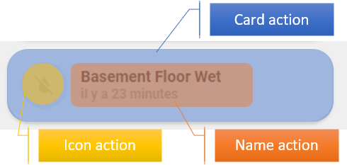
This 'theme' do offer support for customizing actions. Tap, double-tap and hold on different parts (card, icon and name) of the cards could be changed. To achieve this customization follow the instructions on this page.
To change the normal behaviour of tap_action, double_tap_action and hold_action, edit custom_actions.yaml file located under /config/ui_lovelace_minimalist/custom_actions/.
---
ulm_custom_actions:
  variables:
    ulm_card_tap_action: "toggle"
    ulm_card_hold_action: "popup"
    ulm_card_double_tap_action: "more-info"
    ulm_icon_tap_action: "popup"
    ulm_icon_hold_action: "none"
    ulm_icon_double_tap_action: "none"
    ulm_name_tap_action: "more-info"
    ulm_name_hold_action: "toggle"
    ulm_name_double_tap_action: "popup"
Possible values for each variables are :
| Value | Description |
|---|---|
| none | No action |
| toggle | Toggle an entity if available (for binary_sensor and sensor entity, none action is used) |
| more-info | Display more-info window |
| popup | Display UI LOVELACE MINIMALIST popup if available and enabled on card (if not more-info action is used) |
| adaptive | Switch UI LOVELACE MINIMALIST popup on adaptive dashboard if current dashboard is adaptive (if not popup action is used) |
| navigate | Navigate to an other UI LOVELACE MINIMALIST view. Need additional variable (see below) |
Haptic feedback
Next to the action also the haptic feedback of the actions can be configured in the custom_actions.yaml file:
For each action a haptic feedback could be configured:
---
ulm_custom_actions:
  variables:
    ulm_card_tap_haptic: "medium"
    ulm_card_hold_haptic: "none"
    ulm_card_double_tap_haptic: "none"
    ulm_icon_tap_haptic: "none"
    ulm_icon_hold_haptic: "none"
    ulm_icon_double_tap_haptic: "none"
    ulm_name_tap_haptic: "medium"
    ulm_name_hold_haptic: "none"
    ulm_name_double_tap_haptic: "none"
Possible values for each variables (according to the underlying button card) are :
nonesuccesswarningfailurelightmediumheavyselection
Reloading
Once you have edited custom_actions.yaml file, you must reload "UI LOVELACE MINIMALIST" configuration.
Just go to "Configuration" --> "Settings" in Home Assistant and press the "UI_LOVELACE_MINIMALIST" button within the "YAML configuration reloading" section.
Navigate action
To define the path of navigate action, add one of the following depending on your action :
- ulm_card_tap_navigate_path
- ulm_card_hold_navigate_path
- ulm_card_double_tap_navigate_path
- ulm_icon_tap_navigate_path
- ulm_icon_hold_navigate_path
- ulm_icon_double_tap_navigate_path
- ulm_name_tap_navigate_path
- ulm_name_hold_navigate_path
- ulm_name_double_tap_navigate_path
- type: "custom:button-card"
  template: "card_cover"
  entity: "cover.somfy_portail"
  variables:
    ulm_name_hold_action: "navigate"
    ulm_name_hold_navigate_path: "/adaptive-dash/Livingroom"
Call service action
It is possible to call a service using the custom actions on the icon, name and card.
To define the service and its data of call-service action, add one of the following
variables depending on your action :
- ulm_card_tap_service / ulm_card_tap_service_data
- ulm_card_hold_service / ulm_card_hold_service_data
- ulm_card_double_tap_service / ulm_card_double_tap_service_data
- ulm_icon_tap_service / ulm_icon_tap_service_data
- ulm_icon_hold_service / ulm_icon_hold_service_data
- ulm_icon_double_tap_service / ulm_icon_double_tap_service_data
- ulm_name_tap_service / ulm_name_tap_service_data
- ulm_name_hold_service / ulm_name_hold_service_data
- ulm_name_double_tap_service / ulm_name_double_tap_service_data
The following configuration shows the configuration of a service call using the tap action.
- type: "custom:button-card"
  template: "card_cover"
  entity: "cover.somfy_portail"
  variables:
    ulm_name_tap_action: "call-service"
    ulm_name_tap_service: "light.toggle"
    ulm_name_tap_service_data:
      entity_id: light.light_livingroom_2
Overwrite custom actions
When creating a dashboard, custom actions and the haptic feedback can be overwritten on your card definition.
For example, this code will overwrite the tap action on card with more-info action :
- type: "custom:button-card"
  template: "card_cover"
  entity: "cover.somfy_portail"
  variables:
    ulm_card_tap_action: "more-info"
    ulm_card_tap_haptic: "success"
Custom Popups
The implementation of the custom action now supports the configuration of individual popups. The custom popup can be easily configured for each card.
To enable a custom popup the variable ulm_custom_popup must be set within the card.
This variable have three subvariables template, entity and popup_variables. The template must be the name of the
template that should be loaded. The necessary configuration variables for the popup can be configured in
the variable popup_variables.
Usually the popup uses the same entity as the card that calls the popup. It is also possible to overwrite the entity
for the popup. Therefore the entity can be set using the entity variable
within the ulm_custom_popup. This entity variable is optional. It is also possible to disable the entity of the
custom popup it the entity variable within the ulm_custom_popup is set tonone`.
- type: "custom:button-card"
  template: card_power_outlet
  entity: switch.power_outlet_livingroom
  variables:
    ulm_card_power_outlet_consumption_sensor: sensor.power_outlet_livingroom_consumption
    ulm_card_power_outlet_name: Power Outlet Livingroom
    ulm_custom_popup:
      template: "popup_power_outlet_stats"
      entity: switch.power_outlet_livingroom
      popup_variables:
        ulm_popup_power_outlet_sensor1: sensor.power_outlet_livingroom
        ulm_popup_power_outlet_sensor2: sensor.power_outlet_livingroom_consumption
        ulm_popup_power_outlet_graph_sensor: sensor.power_outlet_livingroom
        ulm_popup_power_outlet_entity: switch.power_outlet_livingroom
The available popup templates popup_media_player_infos, popup_light_brightness, popup_thermostat_temperature
or popup_power_outlet_stats can already be used with the custom popups.
This implementation allows the easy creation of custom popups that can be loaded by other cards.
Light, Media Player, Thermostat
The card_light, card_media_player and card_thermostat uses a different approach. Therefore the popup can
be simply enabled by setting one of the variables ulm_card_light_enable_popup, ulm_card_thermostat_enable_popup
or ulm_card_media_player_enable_popup to true.
For developers
To enable action customization on your custom cards, use either the icon_more_info_new, icon_more_info_alert or
the extended_card template. There is no need to implement the ulm_card_actions template anymore.
There are three possibilities to include the custom actions into your custom cards:
Use template extend_card as combination of two cards
The simplest way to create a custom card that uses these custom actions is the combination of two cards.
For enabling the feature the custom card must implement the template extended_card.
Then two custom fields must be used:
item1must be a card that already implements the templateicon_more_info_new. Most of the core cards already implements this template.item2can be any Lovelace card that should extend the card.
If you add custom styles to item2 then following code should be added into the style field
ha-card {
  box-shadow: none;
  border-radius: var(--border-radius);
}
The already available Graph card (card_graph) is an example for this implementation. As
item1 a generic_card is used. The item2 provides a mini-graph-card.
Graph card as example
---
### Card Graph ###
card_graph:
  template:
    - "extended_card"
  variables:
    ulm_card_graph_color: "var(--info-color)"
    ulm_card_graph_name: "[[[ return entity.attributes.friendly_name; ]]]"
    ulm_card_graph_icon: "[[[ return entity.attributes.icon ]]]"
    ulm_card_graph_color2: "var(--info-color)"
    ulm_card_graph_entity2: ""
    ulm_card_graph_hours: 24
    ulm_card_graph_type: "fill"
    ulm_card_graph_points: "0.5"
    ulm_card_graph_group_by: "interval"
    ulm_card_graph_line_width: 5
    ulm_card_graph_icon_color: ""
  triggers_update:
    - "[[[ return variables.ulm_card_graph_entity2 ]]]"
  custom_fields:
    item1:
      card:
        type: "custom:button-card"
        template:
          - "card_generic"
        variables:
          ulm_card_generic_icon: "[[[ return variables.ulm_card_graph_icon; ]]]"
          ulm_card_generic_name: "[[[ return variables.ulm_card_graph_name; ]]]"
        custom_fields:
          item1:
            card:
              type: "custom:button-card"
              custom_fields:
                item1:
                  card:
                    type: "custom:button-card"
                    styles:
                      icon:
                        - color: >
                            [[[
                              var color = variables.ulm_card_graph_icon_color;
                              if (variables.ulm_card_graph_icon_color){
                                return 'rgba(var(--color-' + color + '),1)';
                              }
                              return 'rgba(var(--color-theme),0.2)';
                            ]]]
                      img_cell:
                        - background-color: >
                            [[[
                              var color = variables.ulm_card_graph_icon_color;
                              if (variables.ulm_card_graph_icon_color){
                                return 'rgba(var(--color-' + color + '),0.2)';
                              }
                              return 'rgba(var(--color-theme),0.05)';
                            ]]]
    item2:
      card:
        type: "custom:mini-graph-card"
        entities: >
          [[[
            var ent = [];
            ent.push(variables.ulm_card_graph_entity);
            if(variables.ulm_card_graph_entity2 != "")
              ent.push(variables.ulm_card_graph_entity2);
            return ent;
          ]]]
        line_color: >
          [[[
            var col = [];
            col.push(variables.ulm_card_graph_color);
            if(variables.ulm_card_graph_color2 != "")
              col.push(variables.ulm_card_graph_color2);
            return col;
          ]]]
        show:
          name: false
          icon: false
          legend: false
          state: false
          graph: "[[[ return variables.ulm_card_graph_type=='fill'?'line':variables.ulm_card_graph_type; ]]]"
          fill: "[[[ return variables.ulm_card_graph_type=='fill'?true:false; ]]]"
        hours_to_show: "[[[ return variables.ulm_card_graph_hours; ]]]"
        points_per_hour: "[[[ return variables.ulm_card_graph_points; ]]]"
        group_by: "[[[ return variables.ulm_card_graph_group_by; ]]]"
        line_width: "[[[ return variables.ulm_card_graph_line_width; ]]]"
        card_mod:
          style: |
            ha-card {
              box-shadow: none;
              border-radius: var(--border-radius);
            }
Use template icon_more_info_new or icon_more_info_alert
The card must implement the template icon_more_info_newor icon_more_info_alert. Then it must implement a custom field
item1 which is also a custom:button-card. This card must have the custom fields item1which represents the icon and
item2which represents the name.
Most of the internal card templates uses this option. Take a look into the code.
Generic card as example
---
### Card Generic ###
card_generic:
  template:
    - "icon_more_info_new"
    - "ulm_translation_engine"
  variables:
    ulm_card_generic_icon: "[[[ return entity.attributes.icon ]]]"
    ulm_card_generic_name: "[[[ return entity.attributes.friendly_name ]]]"
    ulm_outlet_power_enable_popup: false
    ulm_card_generic_color: "blue"
    ulm_card_generic_force_background_color: false
  triggers_update: "all"
  state:
    - operator: "template"
      value: "[[[ return variables.ulm_active_state ]]]"
      styles:
        card:
          - background-color: >
              [[[
                if (variables.ulm_card_generic_force_background_color) {
                  var color = variables.ulm_card_generic_color;
                  return 'rgba(var(--color-' + color + '),var(--opacity-bg))';
                }
              ]]]
  custom_fields:
    item1:
      card:
        type: "custom:button-card"
        custom_fields:
          item1:
            card:
              type: "custom:button-card"
              entity: "[[[ return entity.entity_id ]]]"
              icon: "[[[ return variables.ulm_card_generic_icon; ]]]"
              variables: >
                [[[
                  let vars = variables;

                  if(variables.ulm_outlet_power_enable_popup) {
                    vars.ulm_custom_popup = {
                      'template': 'popup_power_outlet_stats',
                      'popup_variables': {
                        'ulm_popup_power_outlet_sensor1': variables.ulm_popup_power_outlet_sensor1,
                        'ulm_popup_power_outlet_sensor2': variables.ulm_popup_power_outlet_sensor2,
                        'ulm_popup_power_outlet_graph_sensor': variables.ulm_popup_power_outlet_graph_sensor
                      }
                    };
                  }
                  return vars;
                ]]]
              styles:
                icon:
                  - color: >
                      [[[
                        var color = variables.ulm_card_generic_color;
                        if (variables.ulm_active_state){
                          return 'rgba(var(--color-' + color + '),1)';
                        }
                        return 'rgba(var(--color-theme),0.2)';
                      ]]]
                img_cell:
                  - background-color: >
                      [[[
                        var color = variables.ulm_card_generic_color;
                        if (variables.ulm_active_state){
                          return 'rgba(var(--color-' + color + '),0.2)';
                        }
                        return 'rgba(var(--color-theme),0.05)';
                      ]]]
          item2:
            card:
              type: "custom:button-card"
              entity: "[[[ return entity.entity_id ]]]"
              name: "[[[ return variables.ulm_translation_state ]]]"
              label: "[[[ return variables.ulm_card_generic_name ]]]"
              variables: >
                [[[
                  let vars = variables;

                  if(variables.ulm_outlet_power_enable_popup) {
                    vars.ulm_custom_popup = {
                      'template': 'popup_power_outlet_stats',
                      'popup_variables': {
                        'ulm_popup_power_outlet_sensor1': variables.ulm_popup_power_outlet_sensor1,
                        'ulm_popup_power_outlet_sensor2': variables.ulm_popup_power_outlet_sensor2,
                        'ulm_popup_power_outlet_graph_sensor': variables.ulm_popup_power_outlet_graph_sensor
                      }
                    };
                  }
                  return vars;
                ]]]
              state:
                - operator: "template"
                  value: "[[[ return variables.ulm_active_state ]]]"
                  styles:
                    name:
                      - color: >
                          [[[
                              if (variables.ulm_card_generic_force_background_color) {
                                  return 'rgb(250,250,250)';
                              }
                          ]]]
                    label:
                      - color: >
                          [[[
                              if (variables.ulm_card_generic_force_background_color) {
                                  return 'rgb(250,250,250)';
                              }
                          ]]]
Use template ulm_actions_card_overlay
If you implement a custom card that is based on another Lovelace card like the
weather card you can simply enable custom
card actions by using the template ulm_actions_card_overlay on the card. This template adds an overlay over the whole card and
reaction on the tap, hold, double tap actions. It also enables the integration of custom popups for the card.
Actions of the underlying card will be disabled by this method.
The weather card gives you an example and will show the usage of this method.
Individual implementation
The following script shows the usage off all necessary variables and template that will be used by the custom actions.
The card must implement the templates ulm_custom_actions and ulm_action_card in the correct order.
The example shows the custom fields item1 that implements the redirection of an icon field and item2 that implements the
redirecton of a name field.
---
custom_card:
  template:
    - "ulm_custom_actions"
    - "ulm_actions_card"
  custom_fields:
    item1:
      card:
        type: "custom:button-card"
        entity: "[[[ return entity.entity_id ]]]"
        template:
          - "ulm_actions_icon"
        variables:
          ulm_input_select_option: "[[[ return variables.ulm_input_select_option; ]]]"
          ulm_input_select: "[[[ return variables.ulm_input_select; ]]]"
          ulm_icon_tap_action: "[[[ return variables.ulm_icon_tap_action; ]]]"
          ulm_icon_tap_haptic: "[[[ return variables.ulm_icon_tap_haptic; ]]]"
          ulm_icon_tap_navigate_path: "[[[ return variables.ulm_icon_tap_navigate_path; ]]]"
          ulm_icon_tap_service: "[[[ return variables.ulm_icon_tap_service; ]]]"
          ulm_icon_tap_service_data: "[[[ return variables.ulm_icon_tap_service_data]]]"
          ulm_icon_hold_action: "[[[ return variables.ulm_icon_hold_action; ]]]"
          ulm_icon_hold_haptic: "[[[ return variables.ulm_icon_hold_haptic; ]]]"
          ulm_icon_hold_navigate_path: "[[[ return variables.ulm_icon_hold_navigate_path; ]]]"
          ulm_icon_hold_service: "[[[ return variables.ulm_icon_hold_service; ]]]"
          ulm_icon_hold_service_data: "[[[ return variables.ulm_icon_hold_service_data]]]"
          ulm_icon_double_tap_action: "[[[ return variables.ulm_icon_double_tap_action; ]]]"
          ulm_icon_double_tap_haptic: "[[[ return variables.ulm_icon_double_tap_haptic; ]]]"
          ulm_icon_double_tap_navigate_path: "[[[ return variables.ulm_icon_double_tap_navigate_path; ]]]"
          ulm_icon_double_tap_service: "[[[ return variables.ulm_icon_double_tap_service; ]]]"
          ulm_icon_double_tap_service_data: "[[[ return variables.ulm_icon_double_tap_service_data]]]"
          ulm_custom_popup: "[[[ return variables.ulm_custom_popup; ]]]"
    item2:
      card:
        type: "custom:button-card"
        entity: "[[[ return entity.entity_id ]]]"
        template:
          - "ulm_actions_name"
        variables:
          ulm_input_select_option: "[[[ return variables.ulm_input_select_option; ]]]"
          ulm_input_select: "[[[ return variables.ulm_input_select; ]]]"
          ulm_name_tap_action: "[[[ return variables.ulm_name_tap_action; ]]]"
          ulm_name_tap_haptic: "[[[ return variables.ulm_name_tap_haptic; ]]]"
          ulm_name_tap_navigate_path: "[[[ return variables.ulm_name_tap_navigate_path; ]]]"
          ulm_name_tap_service: "[[[ return variables.ulm_name_tap_service; ]]]"
          ulm_name_tap_service_data: "[[[ return variables.ulm_name_tap_service_data]]]"
          ulm_name_hold_action: "[[[ return variables.ulm_name_hold_action; ]]]"
          ulm_name_hold_haptic: "[[[ return variables.ulm_name_hold_haptic; ]]]"
          ulm_name_hold_navigate_path: "[[[ return variables.ulm_name_hold_navigate_path; ]]]"
          ulm_name_hold_service: "[[[ return variables.ulm_name_hold_service; ]]]"
          ulm_name_hold_service_data: "[[[ return variables.ulm_name_hold_service_data]]]"
          ulm_name_double_tap_action: "[[[ return variables.ulm_name_double_tap_action; ]]]"
          ulm_name_double_tap_haptic: "[[[ return variables.ulm_name_double_tap_haptic; ]]]"
          ulm_name_double_tap_navigate_path: "[[[ return variables.ulm_name_double_tap_navigate_path; ]]]"
          ulm_name_double_tap_service: "[[[ return variables.ulm_name_double_tap_service; ]]]"
          ulm_name_double_tap_service_data: "[[[ return variables.ulm_name_double_tap_service_data]]]"
          ulm_custom_popup: "[[[ return variables.ulm_custom_popup; ]]]"
For developes who have already implemented the custom actions on their card
There could be some breaking changes:
- The custom card should either implement the
icon_more_info_newor theextended_card - The template ulm_actions_card can be removed
- The variable redirections for the ulm_*_action can be removed
Also the custom popup feature has some breaking changes:
The variables ulm_card_light_enable_popup, ulm_card_thermostat_enable_popup and ulm_card_media_player_enable_popup
aren't used internally anymore. The are only working on their appropriate cards as configuration option for the end user
of the card. So the custom_popup variable should be used instead.
For developers of custom popups
Custom popups must be a custom:button-card. It is also recommended to disable the icon, name and label within the
card configuration using
show_icon: false
show_name: false
show_label: false
show_units: false
The usage of variables within the popup have some restrictions. Default variables of the popup don't work in the same way as for other custom button cards. The default variables -- defined in the variables section -- will always be overwritten by the custom actions caller.
The following code won't work on custom popup cards:
popup_weather_forecast:
---
variables:
  ulm_weather_popup_surpress_first_forecast: false
Instead of using the variables section of the card the variables must be checked within a JavaScript template. The following code shows an example how to check and define a default value of custom popup variable:
element: >
  [[[
    let surpress_first_forecast = ('ulm_weather_popup_surpress_first_forecast' in variables) ? variables.ulm_weather_popup_surpress_first_forecast : false;

    if (surpress_first_forecast) {
      ...
    }

    return surpress_first_forecast;
  ]]]
The code checks if the variable is available before reading from the variable and if the variable isn't available it will set a default value.