Weather Card
Description
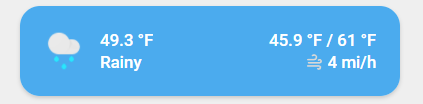
This is a card based on simple-weather-card to show your weather. simple-weather-card lovelace resources must be installed for this one!
Variables
| Variable | Default | Required | Notes |
|---|---|---|---|
| entity | your weather entity | ||
| ulm_card_weather_name | friendly_name |
customize display name | |
| ulm_card_weather_primary_info | extrema |
customize primary info. Set to false to disable. See simple-weather-card for more information |
|
| ulm_card_weather_secondary_info | precipitation |
customize secondary info. Set to false to disable. See simple-weather-card for more information |
|
| ulm_card_weather_backdrop | false |
add backdrop. See simple-weather-card for more information | |
| ulm_card_weather_custom | customize weather data. See simple-weather-card |
Usage
- type: "custom:button-card"
  template: card_weather
  entity: weather.my_local_weather
  variables:
    ulm_card_weather_name: " "
    ulm_card_weather_primary_info:
      - wind_speed
      - precipitation_probability
    ulm_card_weather_backdrop:
      fade: true
    ulm_card_weather_custom:
      - temp: sensor.temperature
Template Code
card_weather.yaml
---
### Card Weather ###
card_weather:
  template:
    - "ulm_actions_card_overlay"
  variables:
    ulm_card_weather_backdrop: false
    ulm_card_weather_primary_info: "extrema"
    ulm_card_weather_secondary_info: "precipitation"
    ulm_card_weather_custom:
      - temp: "[[[ return entity.attributes.temperature ]]]"
  show_icon: false
  show_name: false
  show_label: false
  styles:
    grid:
      - grid-template-areas: "'item1'"
      - grid-template-columns: "1fr"
      - grid-template-rows: "min-content"
      - row-gap: "12px"
    card:
      - border-radius: "var(--border-radius)"
      - box-shadow: "var(--box-shadow)"
      - padding: "0px"
  custom_fields:
    item1:
      card:
        type: "custom:simple-weather-card"
        entity: "[[[ return entity.entity_id; ]]]"
        name: "[[[ return variables.ulm_card_weather_name || entity.attributes.friendly_name ]]]"
        primary_info: "[[[ return variables.ulm_card_weather_primary_info ]]]"
        secondary_info: "[[[ return variables.ulm_card_weather_secondary_info ]]]"
        backdrop: "[[[ return variables.ulm_card_weather_backdrop ]]]"
        custom: "[[[ return variables?.ulm_card_weather_custom ]]]"
        card_mod:
          style: |
            ha-card {
              border-radius: 14px;
              box-shadow: none;
            }
            ha-card.type-custom-simple-weather-card {
              padding: 24px;
            }
            ha-card[bg].type-custom-simple-weather-card{
              color: white;
            }
            ha-card.type-custom-simple-weather-card .weather__info {
              text-align: left
            }